Go With the Flow: How To Choose Cohesive Paint Colors
My easy method for selecting paint colors to create a cohesive flow in an open floor-plan home, while still defining and highlighting separate living spaces.
Choose a color scheme
Those of you who have been following me for a while know well that my favorite color is blue. It has been for years. But since we moved to the coast of Maine, I have embraced the color of sky and water more than ever! I know that when it comes to decorating coastal homes, many people go with white walls in order not to “compete” with the view. I, however, am not a white paint gal. In fact, I have never had a white wall in any home I have owned!
The perfect blue
Instead, I wanted the colors in our home here to blend with the views out the windows — blues, grays, and tans. The pale blue I settled on for the walls in the main spaces downstairs — the living, dining, and kitchen areas — is Benjamin Moore Brittany Blue. The Ben Moore website describes the color this way: “This gentle sky blue with a light gray undertone is soft, airy and calming.” I think it is all of that and more! It has the perfect amount of gray in it to keep it from being too baby-boy sweet. My followers on Instagram love this color too. If I had a nickel for every time someone asked me for the name of this paint color, I could buy, well…., something! Hey Benjamin Moore, would you consider renaming the color Molly in Maine Blue?!
Create flow


Once I selected Brittany Blue as my primary color, choosing the paint colors for the other downstairs surfaces was easy! Here’s my trick: I took the paint card Brittany Blue is on — the one which shows the different shades from lightest to darkest –and used those other shades on surfaces throughout the downstairs. The different shades of a color can also be found here on the Benjamin Moore website. Just search on a color, scroll down, and it shows all the shades, as pictured above. I carried this color flow to some of the hard surfaces too — the backsplash tile in the kitchen and the tile in the mudroom dog shower match colors on this same paint card.
Let me show you how this works in my home!
Start at the front door
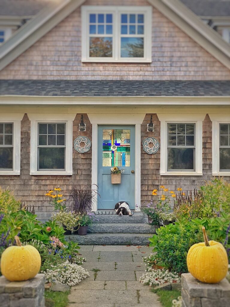
The color story starts at the front door. I painted it Santorini Blue. (And I needed to repaint it when I took this picture, haha! Don’t fret — that task is now done!)
Carry it into the entrance area and mudroom


When you enter the house, the mudroom is to the left and the entrance area is to the right. I chose Glass Slipper in a semigloss finish for the wood paneling in both these areas. The inside of the mudroom door is Midnight Blue. The dog shower tile is a matching color. The cabinets in the mudroom (not shown) are Blue Spruce.
Down the front hallway
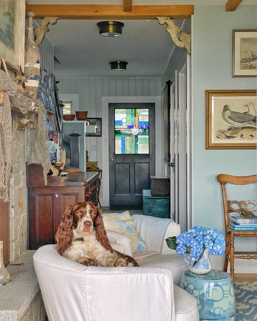
Looking back along the hallway towards the front door from the fireplace area, you can see that I used Midnight Blue on the inside of the front door too. You also get a glimpse of the stair railing, which is the same color. The paneling in the hallway is Glass Slipper.
Up the stairs
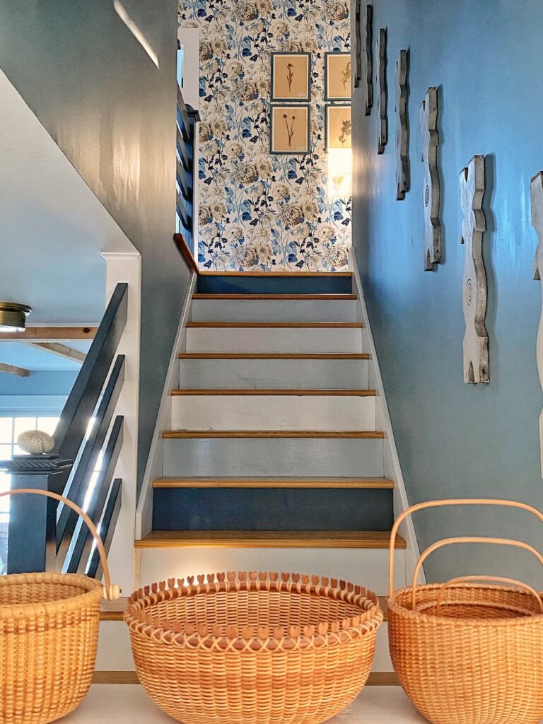
The color flow carries up the stairs, which you can see from the entrance area. I painted the walls here and in the upstairs hallway Water’s Edge. This is a good area to add a little drama with a darker shade! The railing, as I mentioned, is Midnight Blue. The Thibaut wallpaper feature at the top of the stairs pulls in all the blues. The stair risers are also painted all the different shades of blue (and white) in a random order.
Are you getting the idea here?!
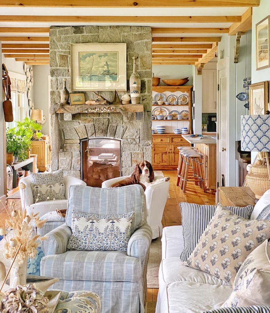
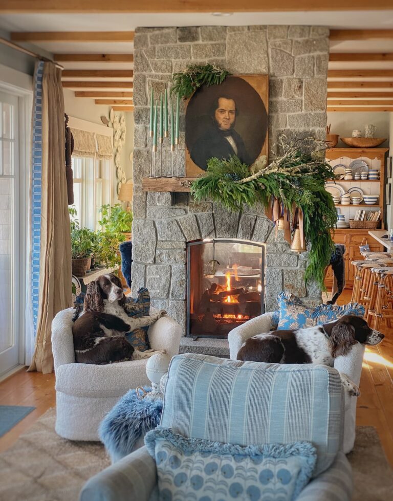
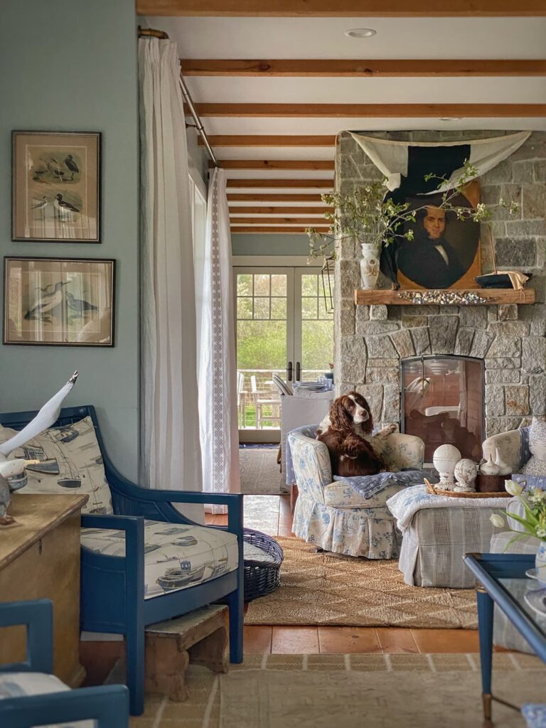
Into the living room and dining area
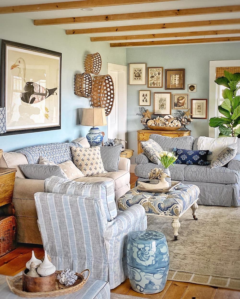
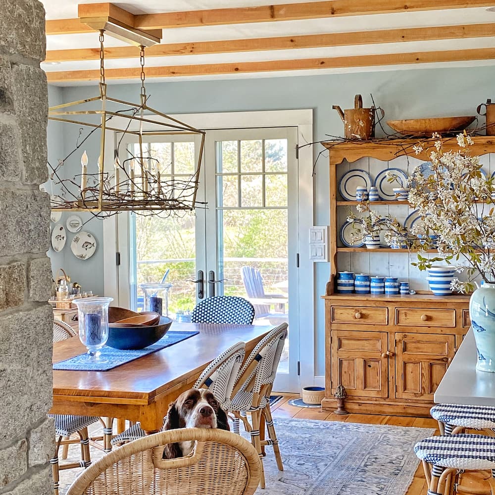
A stone see-through fireplace separates the living room and dining area, but they share the same Brittany Blue walls and pine ceiling beams. Everyone’s favorite color!
And the kitchen too
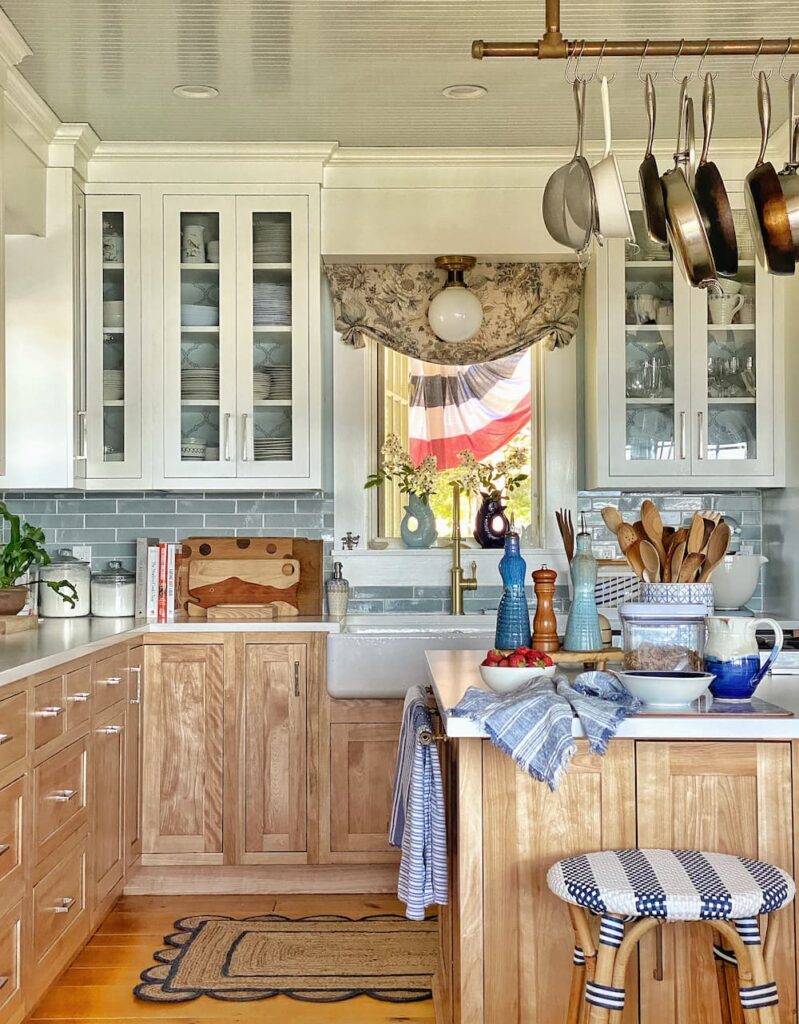
The kitchen walls are also Brittany Blue with a tile backsplash that is a close match. The beadboard ceiling repeats the Glass Slipper from the wood paneling in the entranceway and mudroom.
Will you give this a try?
Now you see how I used the paint card to take the guesswork out of choosing a cohesive paint scheme for my home! I used blue, but you can use your favorite color! I love how the colors flow from one space to the next, creating a calming but colorful home. Let me know in the comments if you have any questions about this method.
Another time we will chat about the paint colors I used in the rest of the house.
Thanks so much for stopping by today!

Questions, comments, or just want to say hello?
I’m always happy to hear from you.
I like the continuity of the blue. It draws you into each room. I have a home with low light. The previous owner painted the two story entry with a white color that has a gray base which to me looks dead in the low light. In the other rooms builder beige reigns supreme and color turns yellowish in the strong summer sun in that area, probably from reflection from foliage outside. Choosing paint colors is frustrating, hard work.
You have done an admirable job!
Thanks, Deb! Going to the hardware store to pick out paint colors is one of my favorite things! I hope you find colors for your home that make you happy!
Excellent idea – from door to door ! I love the stair idea as well .
Thank you, Marilyn!I did the same thing with my stair risers in our previous home — except there it was yellow, blue, and red! The colors in that home were very different than here!
As someone who accidentally painted their walls purple when trying to achieve grey/white, this is very helpful! You’ve done such a great job pulling all the different blues together in the downstairs space
Haha! But you used to love purple! Purple dresses, purple tights, purple shoes…. purple walls!
Wow! This is so helpful! Although I don’t care for the Different Color scheme on the site for my White Dove (perfect Southern California color), the BM site is helpful in making my board with the dollop option! Thanks for sharing this and the pictures of your lovely home.
Hi Holly! I bet you just get a lot of grays for different shades of White Dove. I had never spent time on the BM website before writing this post. There is a lot of helpful ideas there! Have fun with your painting!
I’ve always admired your stain glass on the front door. I think I remember you saying it was in your Maryland home. Was it hard transporting it to Maine? Love your colors and how they flow and mingle with the outdoors.
Hi Julie! The stained glass is an insert that installs over the regular glass, so all we had to do was remove the trim to release the insert. We loaded it carefully in the car and it made the trip with no problem! I was kind of nervous, though!
We used your color card to paint our beach house on St Simons Island, GA! The colors are beautiful and so calming, perfect for a vacation home. We even painted the exterior Santorini Blue!
Hi Paula! Ooh, I love that your exterior is Santorini Blue! It must be beautiful!
Absolutely lovely!! I too am a blue lover so I think it is pure perfection. I love how you used the colors to flow from space to space but also define that space! 😍
Thank you, Kathleen! It was kind of like putting a puzzle together!
While I used to be a no white person, I have found that white can be a really nice choice, but it comes in all shades as Deb found out. You do have to pick your palette even when you go with white. I chose the colors that play out in my house after visiting Colonial Williamsburg and falling in love with the wall colors in the Govenor’s Palace. For those who don’t have Molly’s talent of visualizing colors, don’t be afraid to buy a couple of quarts of the color finalists and try them out.
White is a very tricky color! I love the colors you chose for your home! And what great inspiration you had!
I love blue too and it is so interesting how you used all of the blues on the benjamin moore color card to make nice transitions from room to room while keeping it cohesive. Everything flows perfectly! And they go perfectly with your beautiful view!
I know you love blue too, Amy! Brittany Blue turned out to be an even better color than I thought it was!
Hi Molly,
You have achieved the perfect warm and inviting home. I love the location and your choice of using blue drew me in. Blue is my favorite color as well. I appreciate your tip for taking the paint card for ideas for colors that compliment Brittany Blue. The Springer Spaniels add to the welcoming feel of your home. My husband used to call our dogs “decorator” dogs since a home is complete for me only after making sure my dog is here. 🙂
I’m happy to be following your blog and the posts you create.
Karen B.
Thank you for your kind words, Karen! Using the card is an easy way to make sure the undertones of the colors you choose work well together. And yes, Maddie and Cisco are my favorite decor pieces! Thanks so much for joining me here!
Molly,
Your home is so cozy and inviting! The colors harmonize so well together and now I know why. Excited for more posts.
Hi Rachel! Thanks so much for all your help and support! You are blogging goals!
This is a timely post! I’m redoing our powder room as well as starting to make changes to the color schemes in the house. Blue is my fave and I’m updating the house from yellowed tinted white and greens. It may take me a while to get it all done but your color suggestions really helped me to focus on what I’m doing right now. I love your IG account and so glad to be able to follow your blog! Can’t wait to read more!!!
I am so glad this post is helpful for you! Even if it takes you a while to get it done, this method helps you create a cohesive plan and a vision, and that makes it easier to execute! Good luck!
I love your blues! I am not a white paint girl either. I will take a blue anyway over white. I have used a paint strip as well in a room with some neutrals and it is a great idea. That kitchen is my favorite. I am not really an all white kitchen girl either even though it all the rage today.
Thanks, Sandy! I wanted something a little brighter than our previous all natural wood kitchen, so I went with the white uppers. I used the exact same cabinets on the lowers, though! I love the wood and they hold up much better than painted cabinets!
Molly…
Thank you for the valuable tip about using the paint card hues to chose colors that work together.
Who knew this was the simple but effective way to have harmony throughout our homes!
Alice Strom
Hi Alice! I had never done this before, but I love the result in our home here. I just had to share it with all of you!
I always wondered how your home had such a cohesive look and now I know your secret! I have always been a green person but I’m slowly incorporating more blue into our home. Never have been a white wall gal, either, but that’s what we painted our walls when we moved here. Hmmm…you’ve given me so many ideas!
Hi Jane! It is hard when you have to make color decisions before you have lived in and decorated a space. White can be the easiest answer in that case. When I was thinking about using this method with other colors, green is the first one that came to mind. It could be spectacular!
I love blue. Right now I’m using it as an accent color. I wish I had used your method the last time we painted. I still like some of the colors I picked but the others not so much. We live in Florida and our house has very high ceilings. Since we can’t do the work ourselves, hiring it done is very pricey.
I hope that when it is time to repaint you will now have more information to make color choices that you love!
Your blog could not have come at abetter time. I am painting my kitchen cabinets and wanted a color contrast on the walls to blend but not the same color. This will work better than all the paint samples I currently have! Thanks Molly
So glad this was helpful for you! I think going with a different shade sounds like a good plan!
I’ve admired your beautiful home since I started following you. I can live on the coast of Maine through you. Thank you for sharing your home and tips. I have been searching for the right color card for the kitchen/living room area since they are the same area. Finding that color card and keeping in mind the correct transitional colors of one card will keep me on track. Thanks.
Brittany Blue is really a great color and the card makes it so easy to find other highlight shades! Good luck and have fun!
Thank you, Molly, for this tutorial on choosing colors for flow throughout the home. I have been following you for some time and am a big fan of your use of blue.
Thank you for joining me here and on Instagram!
Hello Molly, I just recently discovered you on instagram and was immediately drawn into your beautiful home, I too am a collector and lover of all things blue, and have been collecting since I was nineteen years old. After reading your post here I will be repainting the insides of built-in bookcases that have been begging for a new color, so thank you for giving me a nudge to start a new blue project and may your skies always be blue!!
Hi Beverly! It sounds like we have much in common! Good luck with your painting project! Painting the insides of shelves is such an fun update!
Molly, I love the approach you took to creating the color scheme for your home. It’s, of course, amazing. Your home has such a collected-over-time look and it’s hard to believe it’s so new … you have a special talent for design. Loving your new blog so much. xo
Thank you, Juliet! That was exactly my goal for the house — to have it look like an old home (with new updates!) that has been passed down through the family. I hope one day to pass it onto our children so they can continue to spend vacations here!
Just prefect! I like the whimsy on the stair case too. Using the color card is very similar to using the binding on fabric to match the colors, Brilliant!
So glad you decided to do this I just love your home!
Hi Pamela! I did the same treatment on the stairs in our previous home, but with different colors. I have gotten the question — so which color are you choosing? Haha! I do believe that the stair risers are an overlooked area for some color and design fun!
Brittany Blue is a fabulous color and it was fun to see how you used the other shades on the card in your home. Best of all they blend so beautifully with the lovely views of the water and sky of Maine! I am so glad you decided to blog. I’ve had a blog since 2008. I haven’t posted there since right before the pandemic but hope to get back to it soon. Welcome to blog land…I am certain you will do well here.
Hi Vicki — I have to admit that I didn’t plan to choose the paint colors that way, but it came together so beautifully in my home that I had to share! I do love the way the colors in the house blend with those outside!
Molly! First I must say that this is a genius paint picking tool. Thank you! And second, congratulations on your blog! It’s beautiful and suits you perfectly! I can’t wait to see where it takes you. So excited for you.
Hi Kelly! Thanks so much for making the hop over here from IG to say hi! I am excited about this new endeavor!
Molly, I love blue! And I love seeing more of your beautiful house. I never had white walls until we moved into out current house, and we had every room painted White Dove to make the house light and cosy, except the former dining room which we turned into a sitting room, it is BM Indigo Batik, including all of the molding and it is dark and cosy!
Looking forward to seeing more of your design work, style, Maine and whatever else you feel like sharing.
Have a wonderful week.
Hi Elizabeth! Ooh, I love that dark paint color just from the name! And I think white walls can look lovely in a home — I just crave color for mine!
Loving all the shades of blue you use! What great tips!
Hi Stacy! Thanks for stopping by! And thank you for pushing me to start this blog!
Your home is just beautiful! I love color and have also never had a white wall! Congrats on your new blog, Molly. I am definitely a big fan. 🙂
Hi Kim! Thanks so much for joining me here! We are kindred souls!
Congratulations on your blog! So happy for you. Happy for me because I get to visit you here and on Instagram.
My favorite color is blue- many shades of blue throughout my home. You inspire me!
Thanks so much for following me here from IG, Jane!
I love all your shades of blues. I think I am going to repaint my bedroom the Brittany blue. It’s so pretty.
I was lucky to find the perfect shade of pale blue! It has just enough gray in it!
I get lost in your pictures Molly! I’m going to add your link to my weekly post tonight. Keep on blogging!
Oh, thanks so much, Jennifer! And thank you for including me in your post! Working on my next post right now!