All The Details On Our Coastal Maine Cottage Kitchen Design
Everything you want to know about our coastal Maine cottage kitchen — cabinets, countertops, backsplash, sink, appliances, and more!
Designing Our Kitchen
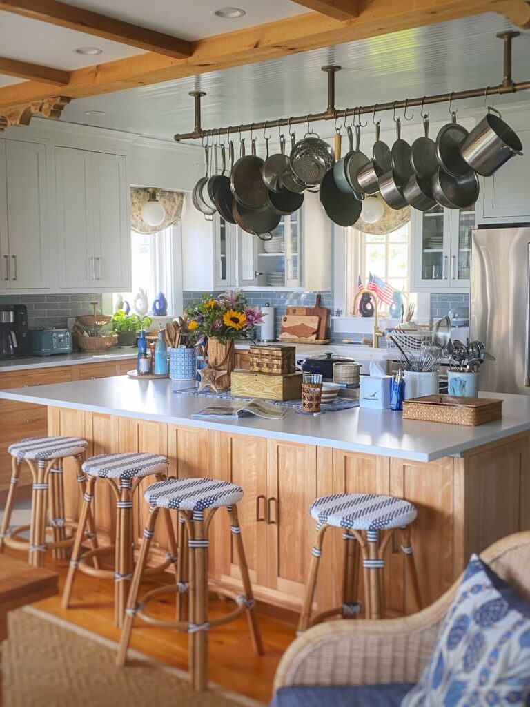
I was gratified by your response to my post two weeks ago on the checkerboard pattern I painted on our kitchen floor! If you missed it, you can read all about it here!
As a follow-up, I thought you might be interested in learning more about the details of our kitchen design.
As I shared in my post Chasing a Dream: Our Coastal Maine House Story, Part 2, I made every single design decision for our custom-built home.
That was a lot of decisions!
And the kitchen is probably the most decision-intensive room in the house.
We are a family that loves to cook, so the kitchen definitely needed to function well, in addition to looking great.
Fortunately, I had experience designing the kitchen in our previous home, so I already knew some of my likes, dislikes, and preferences.
But this was a new kitchen, with a whole new vibe.
Today I am sharing all about how I went about designing our kitchen, including all the elements I chose, how we dealt with budget constraints, and what I would do differently.
Let’s get right to it!
The Inspiration
When I first started thinking about our kitchen here in Maine, I was all over the place.
A fresh white kitchen has all the coastal feels I wanted. But you all know I am a blue gal through and through. And I am a fan of natural wood too.
I knew that I wanted something simple and timeless. And as I mentioned, it had to be a hardworking space too.
This was before I had joined the decor community on Instagram, with its treasure trove of ideas and inspiration.
So I spent a lot of time on Pinterest. And I pinned so many different ideas!
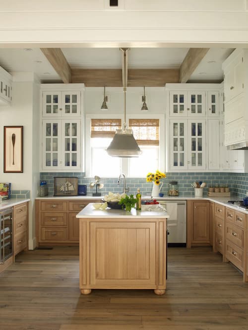
Then one day I came across the image above.
Does it look familiar??!
This is the kitchen in a home designed by Phoebe Howard. You can see more of the beautiful house here!
I knew immediately that this was the look I wanted! (I can be very decisive…)
The clean lines. Mix of white and natural wood cabinets. The pops of my beloved blue.
And since it was designed in 2011, but still looked fresh, I knew it would stand the test of time.
Now that I had a vision in mind, I went about putting my own twist on it.
Bluebelle
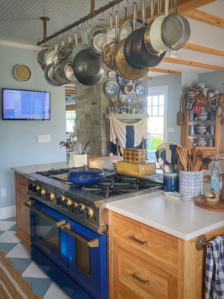
My BlueStar range, which I have named Bluebelle, is the very first thing I chose for the kitchen.
For me it was love at first sight.
Everything else in the house might fall down, but Bluebelle will still be standing. (Well, and the stone fireplace too…)
Strong and sturdy, she is a real workhorse. And yet beautiful too. (Ignore the blotch in the image above — that was the setting sun hitting her. She is a beautiful glossy blue!)
In our previous home, I went through three different cooktops. I picture Bluebelle cooking food for generations of our family to come.
BlueStar ranges have been handcrafted in Pennsylvania since 1880.
They are available in multiple sizes, with more than 1,000 colors and finishes, and options to choose your oven door type, burner configuration, and cooktop add-ons such as a griddle or charbroil grill.
I chose the 48″ RNB Series Range with 12″ griddle in sapphire blue and antique brass trim.
This was definitely a big splurge but it is the heart and soul of our kitchen.
You will see below that I saved on other elements in kitchen in order to make Bluebelle mine!
Cabinets
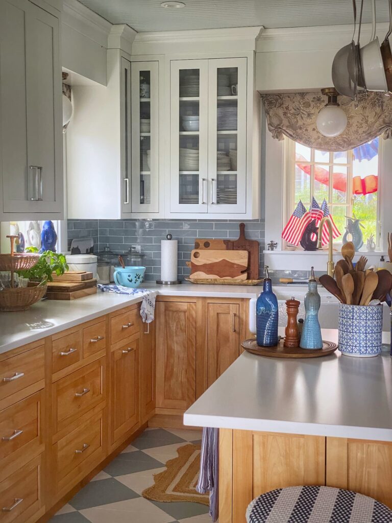
Our kitchen cabinets are made by the Canadian company Cabico.
While I would have loved a handmade custom kitchen, that was definitely not in the budget.
I actually chose Cabico cabinets for the kitchen in our previous home and was very happy with their design and how they held up.
Cabico cabinets are custom designed — meaning you choose the exact size and style — but they are factory made. So you get a custom look for less.
The upper cabinets are a factory-applied white finish that is a close match to Benjamin Moore Chantilly Lace (the trim color throughout our home).
The lower cabinets are natural red birch. These are actually the exact cabinets we had in our previous home! I can attest that they still looked brand new when we sold the house, after over 15 years of use!
I went with a simple shaker door, inset for a furniture look.
Note: The inset doors are generally not recommended for coastal or other areas with high humidity, because the doors can expand and rub. I have not had a huge issue with this. The doors are individually adjustable.
Instead of lower cabinets, I have drawers, except for the corner cabinet, which has a lazy susan shelf insert.
I worked with a local design center, Crestwood Kitchens and Bath, to come up with the exact design specifications. My designer helped turn my vision into reality and provided a lot of practical advice. This design assistance was provided for free with the purchase of our cabinets.
Island
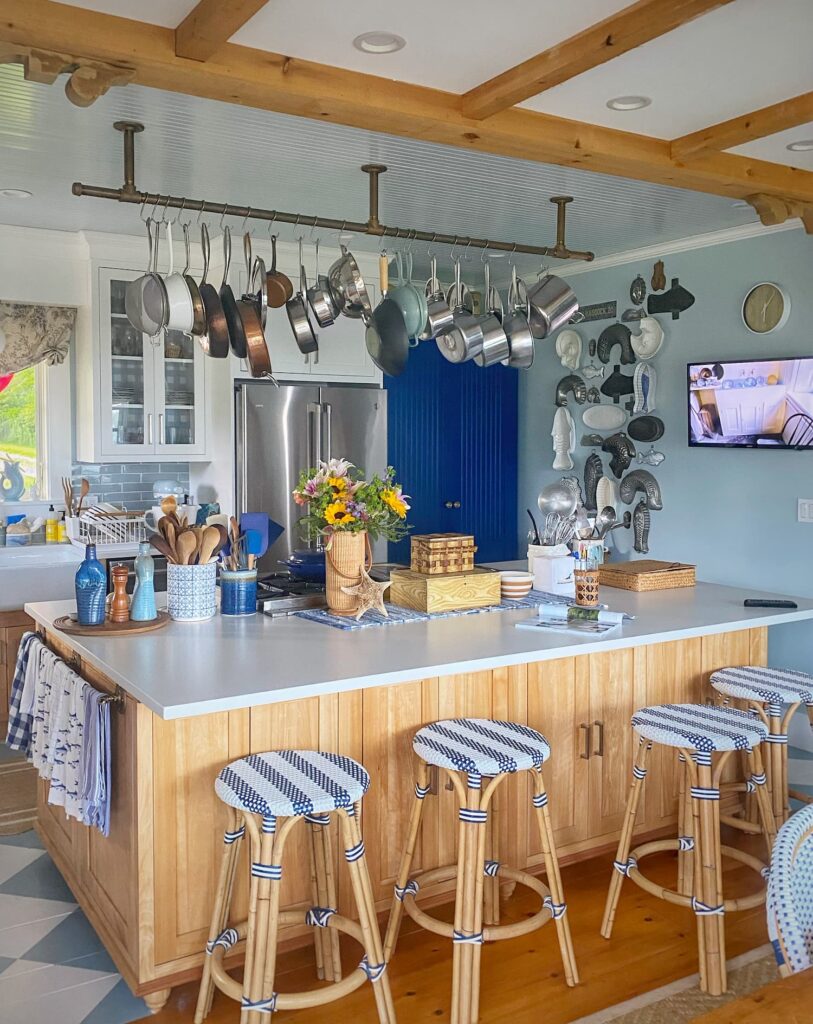
I had never had a kitchen island with seating and it was something I definitely wanted for this house. I was going for that relaxed hang-out-in-the-kitchen feeling.
There are some who say that large kitchen islands are “out”. And I do love the look of a free-standing furniture piece that acts as an island. But we have a large table right next to the kitchen. Two furniture pieces would have looked odd. And I personally love my huge island, whether it is “in” or “out” these days! The most important thing is to choose what works for you and your family!
Our island is a whopping 8′ long by 5′ deep. It provides plenty of work and eating space, and also acts as a nice separation between the kitchen and dining area.
I chose to place Bluebelle in the island so that the cook can enjoy the view! On the right of Bluebelle there are drawers, and on the left a top drawer with a cabinet below. The cabinet has pullout drawers in it. These are the kind of details that the kitchen designer helped me with.
There is a countertop overhang for seating on the dining side of the island. The stools here get a lot of use — eating, working, chatting with the cook. There are cabinets with pullout drawers underneath providing lots of storage!
So you can see, this island was the right decision for our family!
Pantry
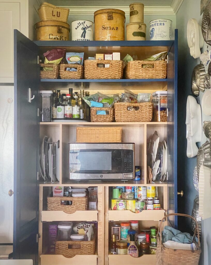
I would have loved a walk-in pantry, but we did not have the space for one.
Instead, I have a large freestanding pantry cabinet, also made by Cabico.
I wanted this cabinet to look like a separate piece of furniture, so I designed it with bead board insets in the doors and different pulls.
Note: I had to sign a waiver due to the possibility of the tall doors warping. After 5 years, I have had zero issue with this.
To further distinguish the pantry from the other cabinetry, I had the factory-applied finish color-matched to Bluebelle. So I did get some blue cabinets after all!
Inside, the cabinet has three fixed shelves on top, and pullout shelving below to hold plenty of pantry goods. It also houses the microwave out of view. Again, these are details that kitchen designer helped me with.
I have to say I love both the form and function of my big blue pantry cabinet!
Tile Backsplash
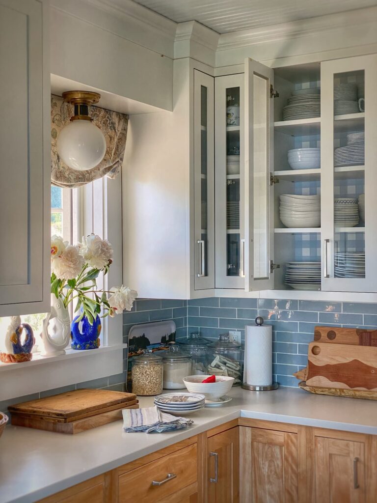
I know that simple white subway tile backsplashes are in vogue, but of course mine had to be blue….
The pale blue backsplash is one of the elements I loved most about my inspiration kitchen!
I chose San Marino 2.25×8.5 ceramic subway tile in Sage gloss. It is definitely blue and not green, despite the color name!
I am so happy I went with a color! It is every bit as timeless as white!
I purchased my tile locally at Distinctive Tile and Design.
Countertops
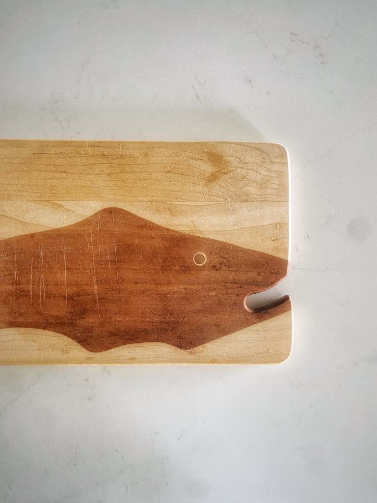
Our countertops are Silestone Eternal Statuario quartz.
I knew that I wanted a white countertop, but I originally chose something different — a solid white quartz.
Due to a last minute snafu, I had to find something different that was available for immediate delivery. This mixup was stressful at the time, but sometimes things happen for a reason. I actually prefer this material, with its faint marble veining, to the solid white I had originally selected.
I love the durability and crisp look of quartz, but the part of me that also loves the perfect imperfections of natural materials, might have preferred marble.
Maybe one day I will make the switch.
For now I am very happy with the quartz countertops I did not originally choose!
Pot Rack
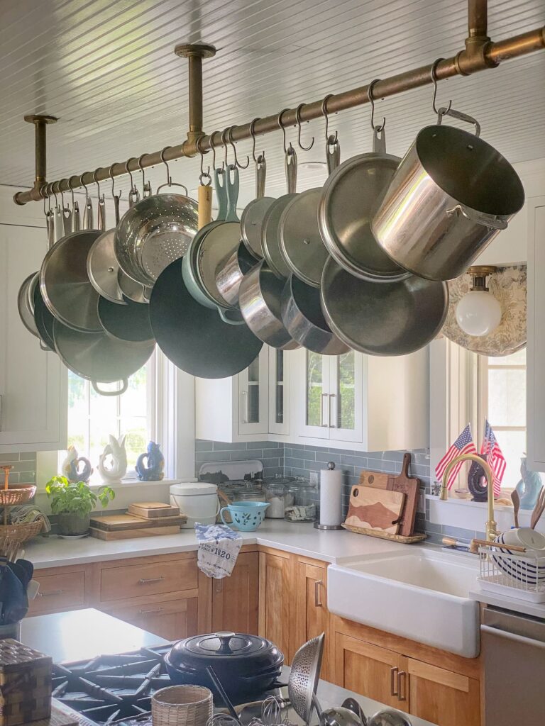
The pot rack is another kitchen element I carried over from our previous home.
When it comes to pots and pans, I know there is definitely team “let it all hang out” and team “hide it all away”, and I am definitely on the former.
I hate digging in a cabinet or drawer amongst the jumble of pots and lids. And they take up a lot of valuable storage space.
I personally like to have my cooking implements within easy reach. (You can see I also have my spoons, spatulas, and wisks in containers out on the counters.)
This time, instead of paying for a pricey custom fixture, I had my builder fashion one from simple brass plumbing parts. He then had hooks custom made. I love the utilitarian style!
Pro tip: I have found that a pot rack secured directly to the ceiling is better than one that is suspended from chains. The chains tend to swing around…
I have a coordinating long kitchen towel bar along one end of the island.
Other Appliances
Dishwasher
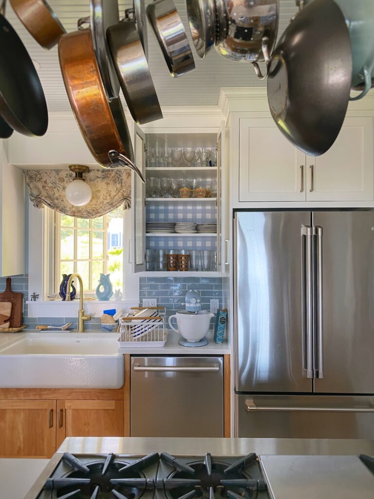
Choosing a Bosch dishwasher was a no-brainer for me. We had a Bosch in our previous home, and I think they are the best. They are whisper-silent, so you are not bothered by the noise if you have an open floor plan, as we do.
This is the model we have here. The website says this is not currently available, but offers other similar options.
Fridge
Our refrigerator is a GE Cafe Series 23.1 cubic foot French-Door Counter-Depth model.
This was the main area that I opted to save money to help offset Bluebelle’s cost.
I went with a fairly basic model. My one main requirement was that it not have a water and ice dispenser in the door. I just don’t care for the busy look.
I will also say, that this is the one element in our kitchen that I really do not like.
For one, it is supposed to be “counter depth”, but it sticks out several inches beyond the counters.
I like the cafe doors on top and the drawer freezer on the bottom.
My big beef with this fridge is that it is designed with deep storage shelves on the doors so that the body of the refrigerator is very shallow. This means that the vegetable bins are miniscule. As a vegetarian, I need plenty of veggie and fruit storage. I purchased plastic bins to hold the overflow produce, but it means I don’t have storage for refrigerator staples and leftovers.
I also don’t love the look of the big stainless steel appliance. Something sleeker and maybe with a wood paneled front would work better.
Or I also have my eye on a BlueStar refrigerator which I could match to Bluebelle.
I want to make it clear that I have not had any issues with the actual functioning of the refrigerator (though it does make a loud humming noise sometimes). It is more an issue of space and looks.
Downdraft
Because of the pot rack, we cannot have an exhaust hood over the cooktop.
We opted instead for a powerful downdraft.
This Cattura 48-inch downdraft was the only one that met all the required specifications.
I don’t use it often, but I have no issues with it!
Sink and Faucet
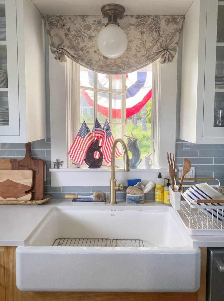
We have this Kohler 36-inch cast iron farmhouse sink.
And this California Faucets pull-down faucet.
I love love love my sink! I definitely prefer one large basin to the side-by-side we had in our previous home.
The white porcelain finish requires up keep, but I would choose it again. I use bleach cleaner and Bar Keeper’s Friend to keep it clean and white!
The functionality of the faucet is good, but I might choose a different, more traditional style now. And I would definitely prefer an antique/natural brass finish instead of the burnished brass we have. It is still a beautiful faucet, though!
Cabinet Hardware
I chose these simple handles in a satin nickel finish for both the cabinets and drawers.
If I was choosing now, I would definitely go with a more traditional look — simple round knobs for the cabinets and a more old-fashioned pull for the drawer. Unfortunately these would be difficult to change at this point because of the holes.
This is not a huge regret, as I do like the sleek unfussy look of the handles I chose!
Lighting

We have a combination of recessed lighting, under-cabinet, and decorative lighting in the kitchen.
The under-cabinet lighting is led strip/tape lighting. It works well. The only downside I see is that it will need to be replaced completely when the little led lights die eventually.
I worked with Fogg Lighting in Portland to develop a cohesive lighting plan for the house and choose fixtures.
The lights hanging in front of each kitchen window are the McCarren Flush Mount in a natural brass finish from Visual Comfort. I adore these fixtures! I think they are the perfect accent, with a slightly nautical feel.
Wall-mounted television
My dirty dark secret is a wall-mounted tv in the kitchen. It pulls out and swivels, so we can watch from the dining area and kitchen. I like to have the Today Show on in the mornings. And it is nice to have a Hallmark movie going while I am doing holiday baking!
This Week Into Next
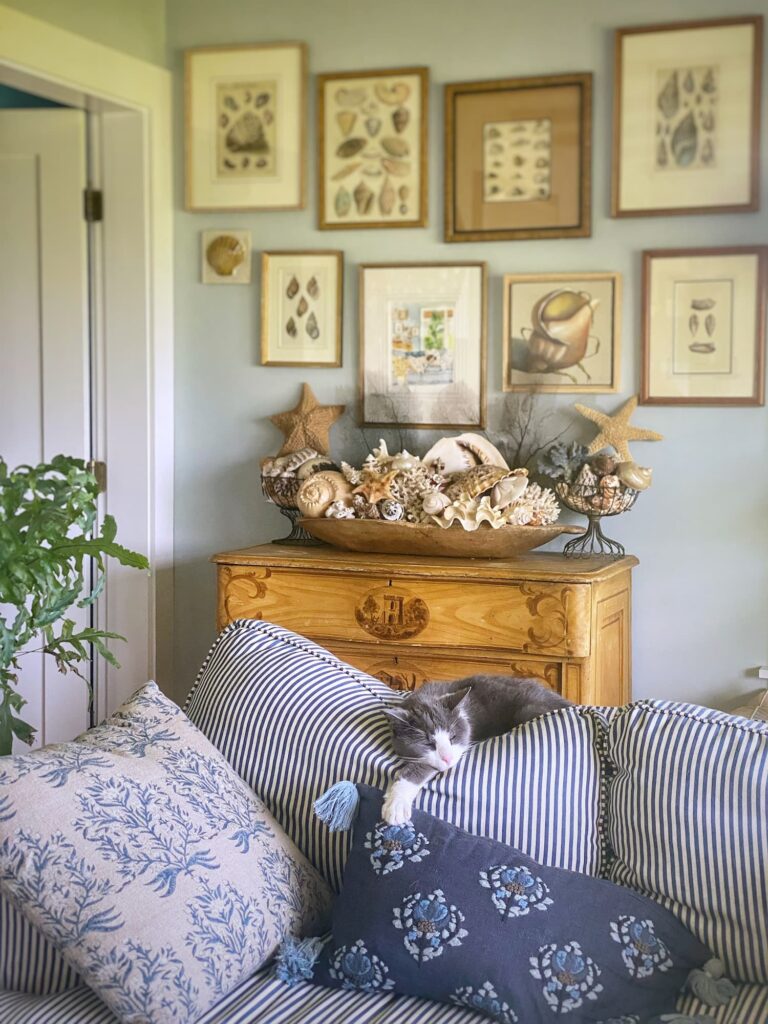
This week started with a rough day for this little guy.
We spent 6 hours at the emergency veterinary clinic on Sunday. I really thought there was a good chance I would not be bringing him home with me.
It turned out Tuck was suffering from acute pancreatitis, and not dire effects of the hypothyroid condition he was recently diagnosed with. An injection of subcutaneous fluids, a vitamin B12 shot, anti-nausea medicine, and a few other medications, and he was already perking up by evening.
Happy to have this chatty furry fellow home and feeling better! Tuck is once again ruling the roost!
The next day friends from Maryland arrived for their annual visit. They brought warmer temps and sunshine. We enjoyed girl talk, July 4th fireworks on the village dock, good food, and plenty of deck time!
This coming Monday, my next guests arrive — my dad and sisters for a week-long visit!
I’d better get going on the guest and bathroom turnovers!
Be well, friends!

Questions, comments, or just want to say hello?
I’m always happy to hear from you.

Love everything about your kitchen! Thanks for sharing all the lovely details.
Hi Karen! Thank you for reading my post!
The perfect kitchen! So cozy and so functional.
Thanks, Linda! I really wanted it to embrace both form and function!
Love these deep dives into the design process Molly! 💙
Thanks for stopping by, Meryl! I hope you are enjoying a sunny day at the pool! Overcast and foggy again here today…
Loved reading about your kitchen and how and why you made decisions. Your kitchen is one of my favorites and I loved your sourcing of everything as I hope to attempt my kitchen some day!
Thanks for reading and commenting, Adare! I hope this well help you with your kitchen when it comes time!
Excellent info! I just recently revamped my kitchen, and I learned there’s always a few hiccups along the way for everybody!
Thanks for reading and stopping by to say hi, Tricia! Yes, it never goes completely smoothly. We also had one of the cabinets end up in South Carolina. Oops! Hope you are enjoying your revamped kitchen!
Loved visiting your working kitchen. So fun to learn about all the design elements and the decision-making process. Please…no shame in a kitchen TV. I enjoy mine while cooking and especially while unloading the dishwasher, and cleaning. Enjoy your summer guests and may they each and everyone bring sunshine and laughter to your coastal cottage. Yea for kitty’s recovery!
Thanks for visiting my kitchen, Julie! It is my happy space! And yes, so happy to have Tuck back with us. I really thought he was a goner.
I just love your kitchen and it is interesting to hear about how you made all of your decisions! The things I love most about your kitchen are blue bell and the matching cabinet and the giant island with seating. It has so much counter space and is so nice for meeting, working and talking in when you aren’t on the porch and that amazing view always visible. What a great kitchen!
Amy
Thanks, Amy! Bluebelle is definitely the star of the show, even though she is tucked away behind the island!
Beautiful post on your kitchen. Your home is lovely, very well thought out. Happy to hear Tuck is feeling better. Enjoy your family.
Hi Suzi! Thank you for reading my post and for your kind words! I am so relieved that our boy Tuck is still with us. Have a great week ahead!
Molly
Bluebelle was my inspiration to get a Blue Star, albeit a plain old stainless. Being an artist I would have loved a color but it didn’t work with the existing kitchen.
Did you go with the sealed burners or open burners? I went with the Open as it seemed more “professional”. I find them a bear to clean and wonder if you have the same ones and have any tips.
I lived near Orrs Island in the hippy-dippy ’70s… now in Vermont.
Cheers,
Cristine
Hi Cristine! I hope you love your BlueStar aside from the burners. They only had the open burner option when I got mine. I don’t have a problem with them, but I should clean the pans underneath them more often than I do. Out of sight out of mind, haha!
Thank you for sharing your lovely kitchen, Molly. I too love the BlueStar range! It is now most definitely in my inspiration book for a possible new build!
Thanks again,
Barbara
Thanks for reading, Barbara! Happy I provided you with some inspiration!
Hi Molly, I’m so glad Tuck is feeling better, those darn animals keep us hopping, don’t they? Love your beautiful kitchen, and that oven is just amazing! Have a great week with Amy and your family!
Hi Ann — Yes, I was so sure this was it for him. Looking forward to time with family!
Molly,
I love your beautifully appointed kitchen. The navy range is stunning.
Thanks, Rachel! It is the heart of the kitchen!
I’m so glad your Tuck is feeling better! I adore every detail of your kitchen! We remodeled our kitchen about 2 years ago and I loved making all the design choices. I have always wanted a pot rack and I really like how you and your builder came up with this.
Thank you, Jane! I enjoyed making the design choices too, but in combination with the rest of the house, it was overwhelming at times! The pot rack was a cost-effective way to get a custom piece! I am so relieved that Tuck is feeling better.
So many gorgeous details. I love it.
Thank you, Renae! It is first and foremost a working kitchen!
Thank you for sharing so many details! If I am ever lucky enough to build my Maine dream house, these will come in handy! I just love your choices.
Thank you, Julia! I appreciate you taking the time to comment!
LOVE your kitchen! Bluebelle sure is a beauty, & I absolutely adore your island!!! Enjoy your visit with your dad & sisters 🤗! And so glad your kitty is ok!
Hi Courtney! We spend so much time at the island and in the kitchen in general! We went to Monhegan today and going on the Cabbage Island Clambake cruise out of Boothbay Harbor tomorrow! Having fun!
Finally got to read the latest blog on your kitchen Molly..boy lots of decisions you had to make but the final results show the love you put into it. Hugs to Tuck and enjoy your company.
Thank you, Joyce! SOOOOO many decisions! Fortunately I am a decisive person! Tuck is doing well, thanks!
Molly, your kitchen is one of my favorites and I love seeing your inspiration photo. Bluebelle is a stunner. And your pot rack a work of art. So happy to hear Tuck is on the mend and ready to welcome his next guests! xo
Hi Juliet! Thanks so much! I was so happy with how the pot rack turned out! Not bad for plumbing parts! Tuck is doing well, but has spent they day in hiding since my sister brought her dog, hahah!
I absolutely love your working kitchen and all of the decisions and love you put into designing such a wonderful space! I’m with you on having pots easily accessible and I think your brass piping is such creative and functional solution! The blue that you incorporated is perfect and gives the space such a magical vibe! You really put alot of thought into everything. Thanks for sharing!
Thanks, Nori! We truly spend so much time in this space. I am so happy with how it turned out! Thank you for reading my blog post!
Your kitchen looks gorgeous!
Thank you, Stacy! It is definitely my happy place!
Hi,
I loved hearing about all of the choices that you made for your kitchen. We just bought an older home with a kitchen that is in dire need of a makeover. It is so overwhelming to make the choices and also hard to convey my “vision” to others as so many people just want the same standard items and I would like it to look more eclectic. Anyway, it was so helpful to read about how yours came together! Thank you.
Hi Hilary! I hope this post was helpful for you as you plan your kitchen reno! Stand your ground, and don’t let people give you standard when you want something special! Have you made a vision board or saved images? Maybe that would help others see what you want! Good luck!
It’s so beautiful Molly, every single detail!
Thank you, Kristin! It is my happy place!