Snug Or Den? My Rarely-Shared Comfy Cozy Little Room
Whether you call it a snug or a den, the comfy cozy little room tucked behind our living room is warm, inviting, and the perfect place to relax and unwind. Come join me there!
What Is a Snug?

Have you noticed that “snugs” seem to be the rage right now?
All over social media, people are talking about enjoying their morning coffee in their snug.
Afternoon tea and a book.
And of course, bingeing the latest Netflix series cozied up at night in the snug.
But what exactly is a “snug”?
This term made its way across the ocean to the U.S. from the U.K..
There it has traditionally described a small private room or space in a pub, where you could go to have a quiet drink with friends.
In the home, this idea has translated into a cozy and comfortable space tucked out of the way and designed to feel warm, inviting, and intimate.
Think soft seating, warm lighting, personalized decor, and walls painted a saturated color.
A fireplace and wood paneling would be a bonus.
Snug or Den?

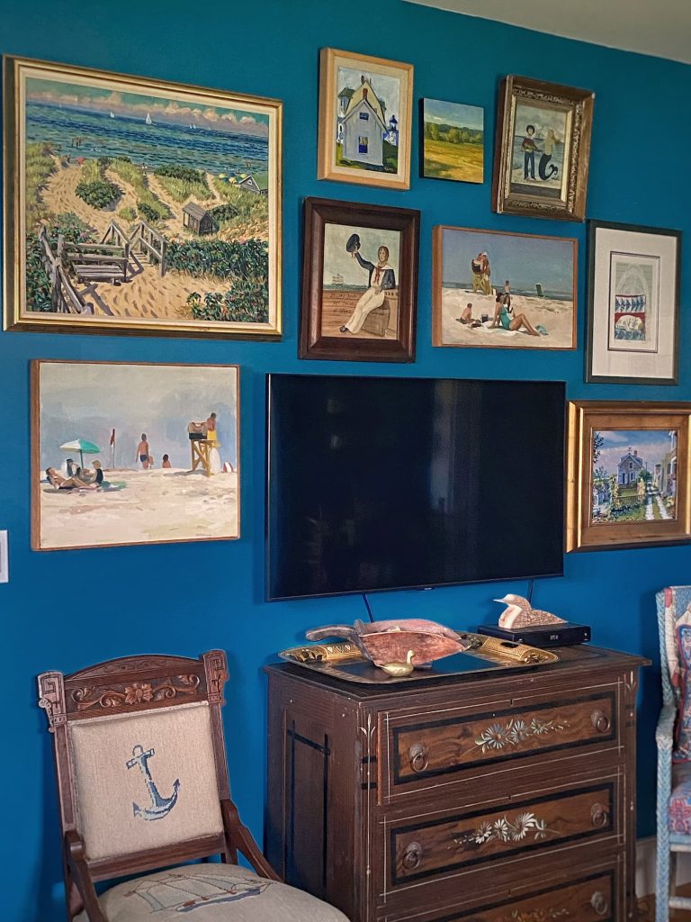
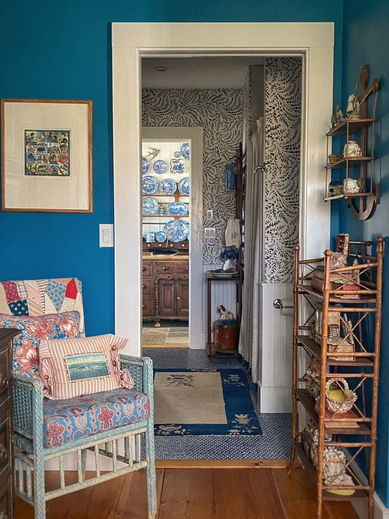
We have a comfortable little room off our open-concept living room that is home to a sleeper sofa, two narrow bookcases, a chest of drawers, side table, and trunk-as-coffee-table. The tv also resides there.
In the winter, when darkness descends in the mid afternoon, it is my cozy lair.
Unlike the living room, with its multiple large windows looking out on a black landscape, the den has just a few windows set up high. When I sit on the sofa (Maddie on one side, Cisco on the other) and face the tv, the windows are above and behind me.
So I feel protected, warm, and, well, “snug”.
There is just enough room in there to pull out the full-size sleeper bed. My son Jack slept there when he was kicked out of the guest cottage so that his wife and I could isolate away from the rest of the family during “Covid Thanksgiving” a couple years ago. Jack is 6′ 2″, but he loved it because he said it was like the whole room was a bed. He might be a grown and married man, but sometimes he still sounds just like his teenage self, ha!
So it is certainly a tight or “snug” space.
But I have always called it the “den”.
Sometimes the “tv room”, which, I must admit, sounds like a throwback to the 1950’s.
So which is it?
Den or snug? Snug or den?
I asked my new friend ChatGPT what the difference is between the two.
He/she/they told me the difference comes down to four elements:
- Size: A den is generally larger than a snug.
- Purpose: A snug is usually designed for relaxing and unwinding, while a den can be multipurpose — tv-watching, reading, playing games, and even working.
- Location: Snugs are often tucked away and isolated. Dens are usually more centrally located and open to other rooms.
- Decor: Both spaces might be furnished in a cozy manner, but dens will typically have larger seating arrangements, entertainment centers, and possibly a desk for work or study.
So, after doing my “research” for this post, I think our little room might accurately be called a snug!
Or maybe this new trend is unduly influencing me.
What do you think?!
No matter what you call it, (I am going to give “snug” a try in this blog post) here is how I designed this space to be cozy and comfortable, with a totally different feel from the other downstairs rooms.
Paint Color
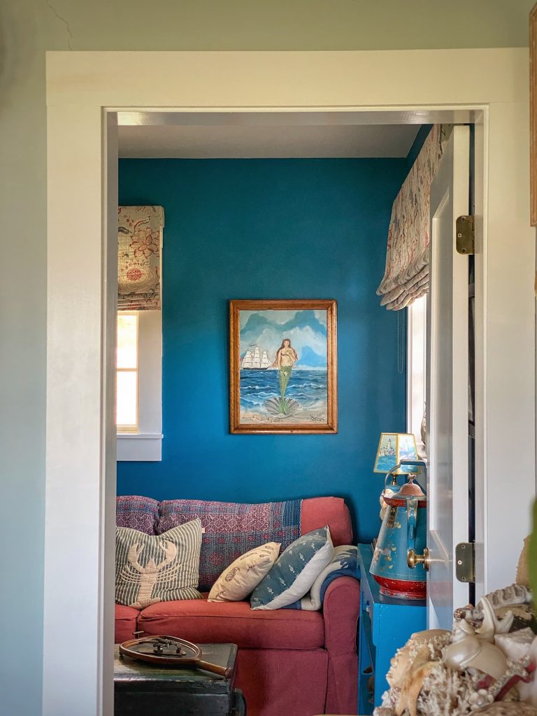
I would say that the most distinguishing feature of the snug is the wall color.
Everyone on Instagram loves Benjamin Moore Brittany Blue, the pale gray-blue that covers the walls in every room downstairs except this one and the bathroom.
And it truly is the perfect color to serve as a backdrop for all my furnishings, while not competing with the ocean view out the windows.
But, as I mentioned, the snug does not share that view. It and the bathroom are also the only rooms separated from the others by a door.
So it made sense to go with something different in both these spaces.
I also wanted to surprise people when they walked into the snug. You know I always love to include something that is not like the others!
I chose this color, Benjamin Moore Americana, late one night when my builder was pushing me for a paint color.
I was having a hard time making a decision. Believe it or not, I was thinking of going with a green, but I was stuck.
Obviously a sign that I was headed in the wrong direction…
And then, while searching and scrolling, I saw an image of a red, white, and “Americana” blue bedroom, and I knew what I wanted.
I know that this bright saturated color is not for everyone. I have actually had people on Instagram tell me directly that they don’t like it.
(Unfortunately for those strangers, I won’t be repainting the room for them.)
I love the color!
Benjamin Moore describes it as “a deep teal blue that captures the comfort and sophistication of a classic jean jacket.”
I love that description too!
And I always think small rooms look great painted a saturated color. Like a tiny jewel box.
This paint color definitely sets the tone for the room!
Artwork
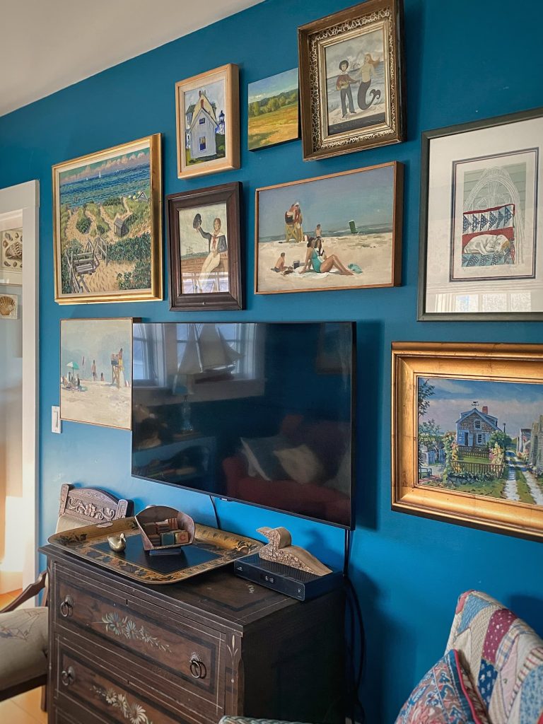
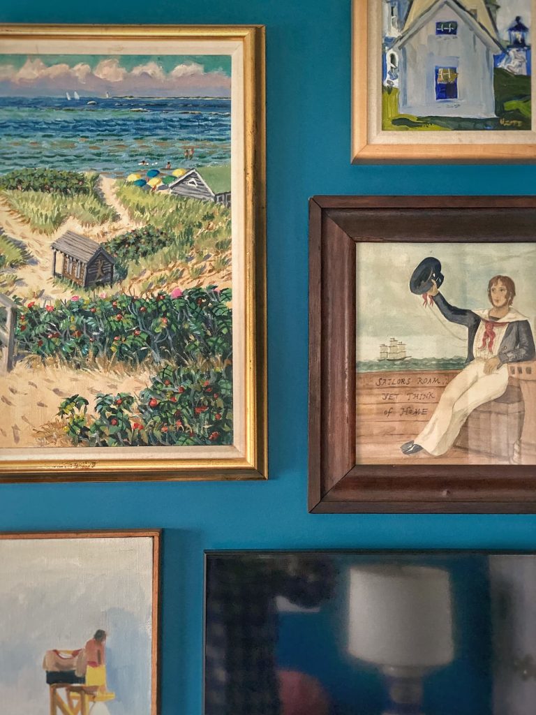
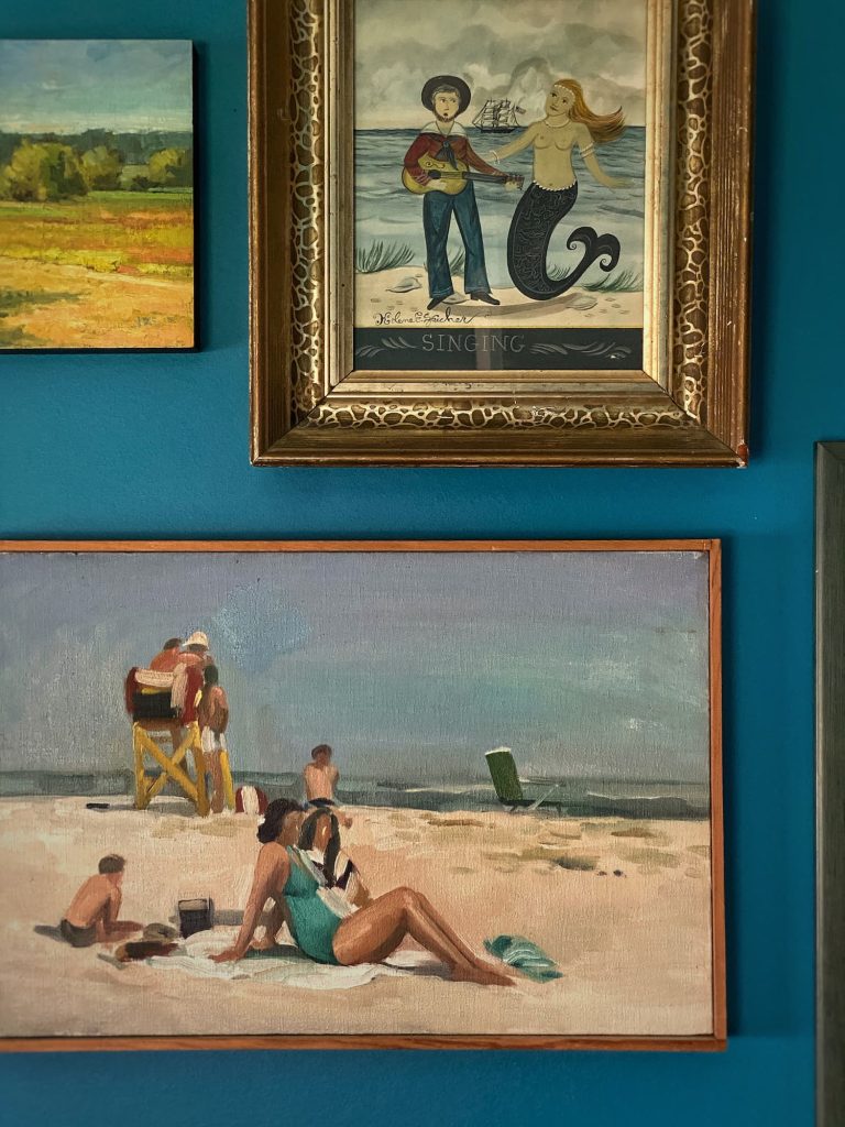
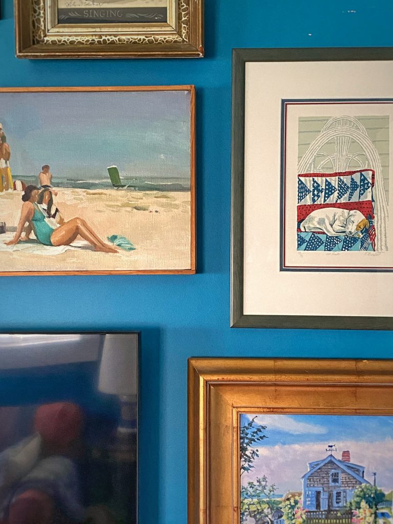
I recently added a few pieces and rehung the artwork on the tv wall in the snug.
Previously it was matchy-matchy, symmetrical, and, well, kind of sad looking. I wanted an arrangement that was a little more fun and dynamic.
The artwork hanging in this room is, for the most part, pieces I have had for years and some of the nicest artwork I own.
They are also all deeply personal pieces.
A few from a Nantucket artist that we purchased when our family vacationed there.
Two paintings by Kolene Spicher, who sadly passed away last year.
A pair of beach scenes that spoke to me at an estate sale when we lived in Maryland.
I followed almost none of the wise advice I offered in my recent blog post Hang a Perfect Grid Gallery Wall — With No Extra Nail Holes when I hung the new gallery wall.
In my defense, this was not a symmetrical grid layout. The artwork was different sizes and so was the spacing.
I did lay it out on the floor first, but I did not create templates. I was too anxious to get things up on the wall.
Lesson learned! There are so many extra nail holes! And the whole process kind of gave me a headache.
But I love how it came out.
The art on this wall and around the room is colorful and happy, evoking sunny days on the coast.
You can read more about choosing and hanging different types of wall decor in my blog posts Creative Wall Decor Part 1: Art and Gallery Walls and Part 2: Non-Art Displays.
Shell Trinket Collection
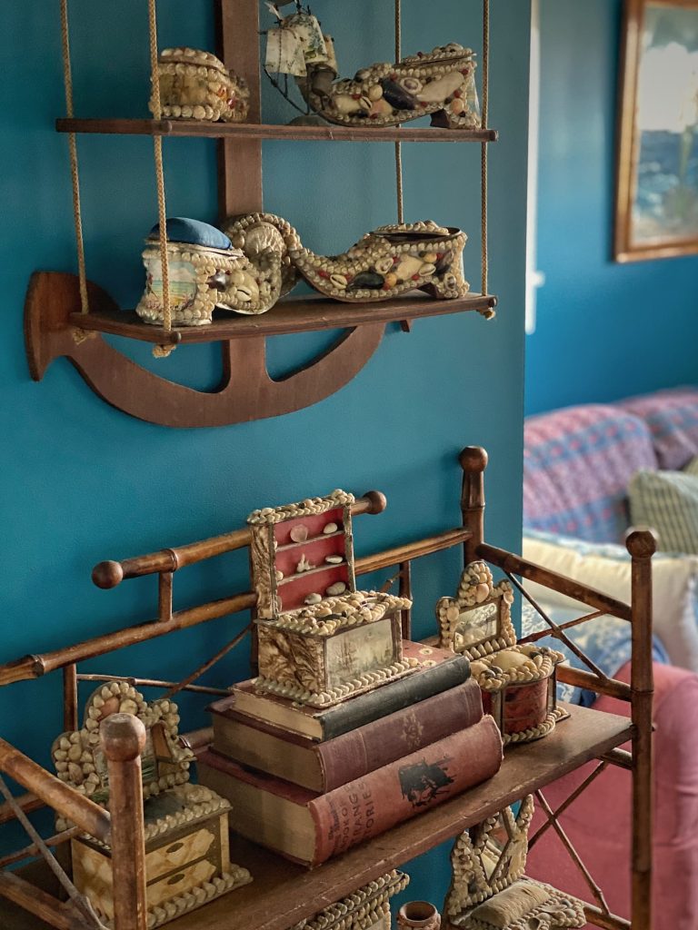
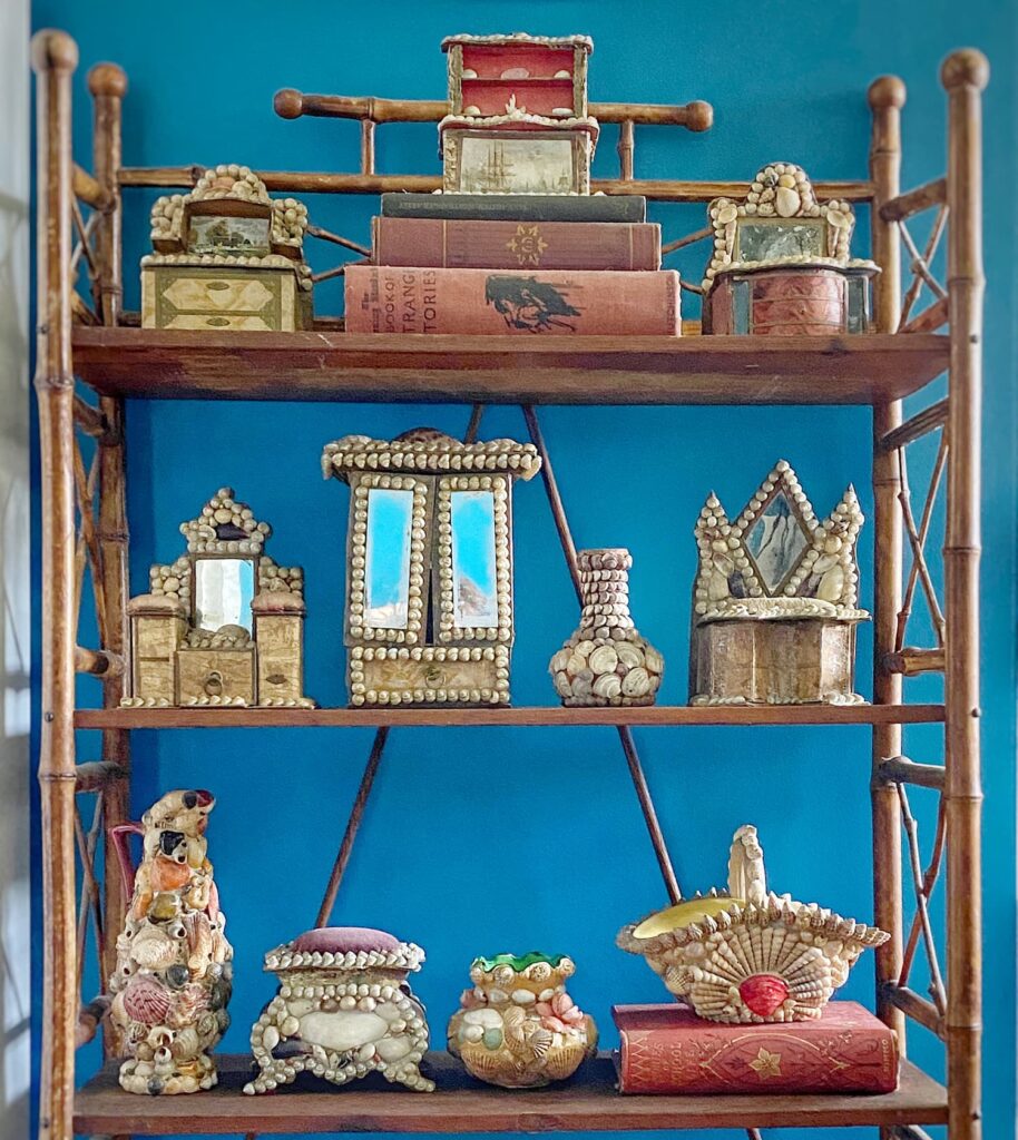
The snug is also home to my collection of antique shell trinkets.
Most of these “shellwork” pieces date to the late 1800’s. They include traditional jewelry boxes, whimsical pointy-toed shoes, miniature furniture pieces, and small vases, all covered in tiny shells!
I have collected them over the years from antiques shows, estate sales, and online sites such as Etsy.
Here I have them displayed on a narrow antique bamboo étagère, that tucks perfectly into the small space next to the door to the bathroom.
Above it hangs a vintage handmade shelf shaped like an anchor.
You can read more about these shell trinkets and other shell decor throughout my home in my blog post Coastal Style | Decorating With Seashells All Year Round
Unique Furniture Pieces
The snug may be small, but it definitely packs a design punch!
In addition to the art and shell work, there are some unique furniture pieces in this little space.
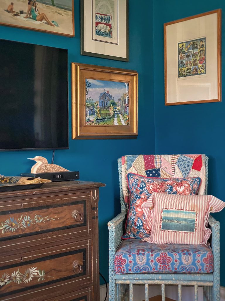
In the corner is a chair from everyone’s favorite antique set I have in the bedroom. The original blue paint on these is just so good! I kept the red and blue cushion fabric my mom chose on this one, so it always makes me think of her.
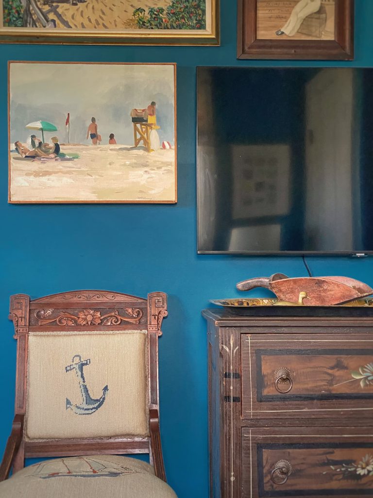
The second occasional chair is a carved Eastlake antique covered in a needlepoint design of a sailing ship and an anchor. I obviously had to have the pair when I spotted them at an auction! This one’s mate resides in the guest cottage.
In between the two chairs I placed a Victorian painted cottage chest of drawers. With its dark faux wood grain finish and red, white and blue painted flowers, it is perfect for my “Americana” snug!
You can read all about my love for Victorian painted cottage furniture in my blog post The Charm and Whimsy of Victorian Painted Cottage Furniture
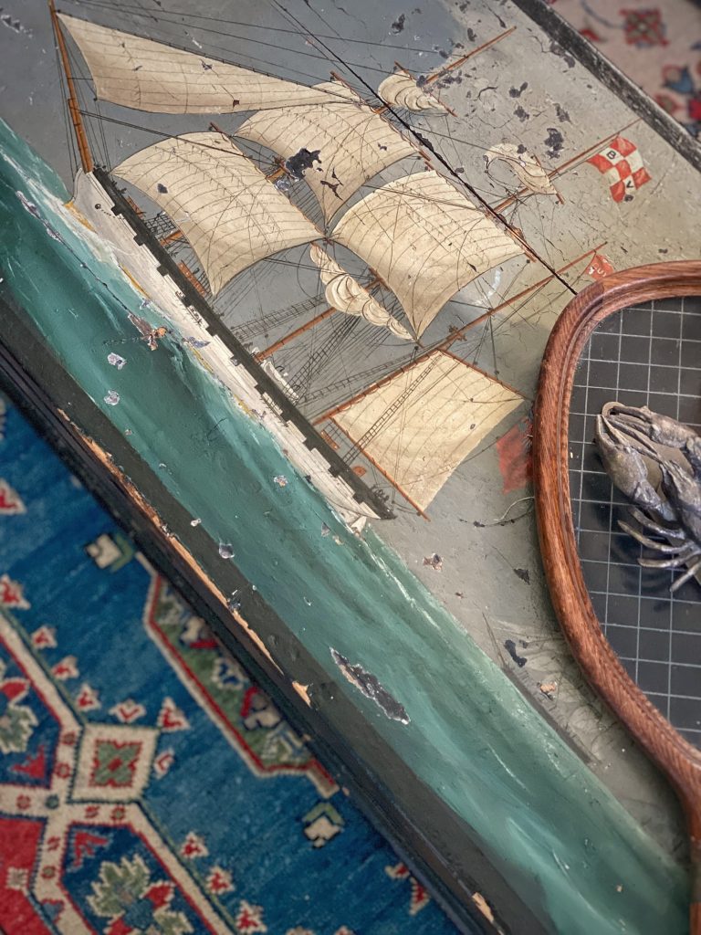

For a coffee table, I use an antique chest I got from my parents’ home. A wonderful scene of a large sailing ship at sea is painted on the top. It is a dark and moody piece, which adds to the cozy vibe of the room. My parents purchased it in England when they lived there.
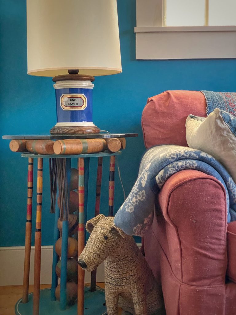
The last fun piece in this room is a small table I fashioned from a vintage croquet set in a blue-painted round stand. I simply ordered a glass top from Amazon to turn it into a side table.
Other Decor
Layers of cheery pattern and bright color finish the space and add to the cozy charm.
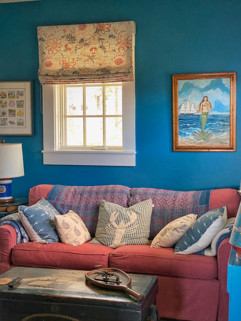
Mix-and-match red and blue throw pillows tossed across the faded-red sofa include one with a whimsical lobster design.
Quilts and blankets drape across the backs and arms of seating, ready for a snuggle.


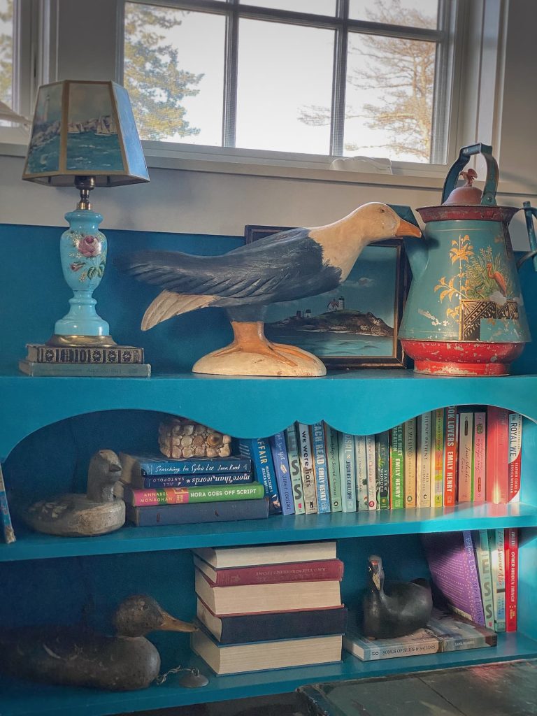
A beautiful handpainted tole tray sits atop the chest of drawers.
Bird decoys adorn a bookcase painted Americana blue to match the walls.
A red sailboat leans in a window.
Simple roman shades in a bold floral print close at night to create an intimate feel.
And a colorful Turkish rug found on Etsy grounds the entire space.
I would say this room checks all the boxes to be considered a perfect snug!
At least I definitely feel snug when I spend time in here.
So, snug it is, I guess!
Now, I need to get used to calling it that!
This Week Into Next


On Monday I am making a quick trip to Brookline, MA to stay for a couple nights with a friend.
Tuesday we will be up bright and early to head to the Brimfield Flea Market for the day! I am so excited!
You can read about my experience last year at Brimfield in my blog post Let’s Go to the Brimfield Flea Market Together.
I will definitely be sharing this year’s outing on the blog next Saturday!
This week In Zoe’s Kitchen a mystery guest host will be sharing recipes for Green Breakfast Smoothies and Asparagus Risotto.
You certainly won’t want to miss this special Mother’s Day newsletter!
And speaking of Mother’s Day, I wish all you mothers and mother figures a peaceful and relaxing day!
Be well, friends!

Questions, comments, or just want to say hello?
I’m always happy to hear from you.


Sam is going to be so excited about an entire post dedicated to the Uthred room. Looking forward to hearing all about Brimfield, and happy Mother’s Day!
I thought about mentioning Sam’s name for the room, but I still have no idea where that comes from. Happy Mother’s Day, sweet girl!
I’ve never heard of a snug where have I been😂 we always called it a den too. Have fun at Brimfield. Cant wait to see what you find🙌🏻
Hi Ann! I guess you aren’t spending enough time on IG, ha! I am excited for Brimfield. Just a quick day in and out. I am also looking forward to a couple days in the city. And it is supposed to be warm too!
I loved seeing the snug and all the unique collections and decor…it’s definitely a snug and not a den. I first heard the term snug used when I was watching Youtube shows of British cottages for sale. Yours is the perfect space to snuggle up with your furry friends and watch some good British TV and movies. Looking forward to seeing the treasures you find at Brimfield. Safe travels and happy mother’s day!
Hi Julie! The “snug” is definitely home to some of my favorite pieces — art, collectibles, and furniture. A friend was here recently and we walked back there for some reason and he was surprised — didn’t even know that little room was tucked back there! Happy Mother’s Day to you too, my friend!
I love your “snug” so much! My parents built a small house many, many years ago and my dad used to have the word “snug” taped to the door of his tiny den. It was a snug indeed. It was small and cozy and he and my mom spent many happy hours in there reading, talking and just being together. Such a nice memory you brought back for me! Happy Mother’s Day!
Hi Debra — That sounds so sweet! That little room sounds like it definitely fits the definition of a snug! Happy Mother’s Day!
Molly,
You are an expert on hanging art. Your gallery walls are fabulous!
I do like the color on the walls of your snug. But I am a blue lover! If you visited me it would only take a few minutes for you to see that!
Always fun to see your postings on IG and reading your weekly post!
Enjoy Brimfield. I would going back one day!
Hi Kathleen! Thank you! I must admit this wall challenged me a bit. I definitely should have used templates. I kept measuring and remeasuring, ha! I was trying to save time, but I think it probably ended up taking me longer! I am so happy you enjoy my posts. Thank you for joining me here and on IG!
Happy Mother’s Day to you too!
Snug in decorating is a new word to me. I guess the only room in my house that would qualify in the office/library. That’s what it was labeled on the house plan printout. We call it the library. It has shelves of books plus my piano, and two comfy chairs. This is where my husband and sit every morning with coffee and read news, emails, etc. When my granddaughter was very little, her family visited the Georgia Aquarium. When she came to my house the next time she renamed this room the Bookquarium. So that’s what we still call it even though she is 26, married and has a 13 month old precious boy!❤️
When I read your posts, I always get a cozy “Snug” feeling.
Hi Nancy! Oh, you should never never change the name of your room from Bookquarium to snug, no matter how old your granddaughter is! That is too precious! I am so happy my posts have a cozy feeling to them! That is exactly how the house feels to me!
Love every single thing in this utterly charming snug! personally I think small rooms with less natural light are best painted a saturated color. And Americana is a favorite decor theme of mine. Your pieces are wonderful right down to the Aladdin inspired tiny shoes. The art wall is superb. Don’t change a thing. Thanks so much for sharing.
Hi Pamela — Thank you so much for your kind words. The new gallery wall really is such an improvement over the sad arrangement I had there before. It was one of those situations where you live with something for a long time and when you finally change it, you wonder why it took so long. Aren’t those little shell-covered shoes fun? My favorite shell trinkets are the little pieces of furniture, and particularly the hutch. Kind of a strange thing to decorate with shells, when you really think about it.
Hi Molly. I love your snug and all of your fantastic collections, especially those amazing paintings on your gallery wall. Happy Mother’s Day! Can’t wait to see what you find on your trip.
Hi Miche! Thank you! Yes, those are some very special paintings. I am glad to be finally displaying them as they should be. The previous display really was uninspiring. Have a wonderful weekend!
Good morning, Molly! You’re snug, if definitely … snug. I love it … for a small, cozy space it packs a lot of punch. Americana is the perfect paint color and I love love love your red sofa bed. So many fun, unique and personal pieces in that room … and all your art. You have great art throughout your home. Have a wonderful trip to Brimfield. Can’t wait to see what treasures you bring back. xo
Hi Juliet! Thank you, yes, it is definitely snug and it definitely packs a design punch. I love to go big in a small space! Brimfield was a quick trip, but it was fun! And I did not leave empty-handed!
Molly, a Most happy Mother’s Day to you in Maine.
Mission Accompli! While the entire room invites snuggling, the faded sofa, the flattened stacked pillows, the old soft throws invite a seriously relaxing snuggle.
So looking forward to sharing your adventures in Brimfield!
Diney on Mercer Island
Hi Diney! It is definitely a cozy spot to snuggle up! I had a quick but fun visit to Brimfield. And I did not leave empty-handed!
I think you get the best of both words by calling it a snug in the winter when it’s dark and cozy and a den in summer when it’s light late!!
Hi Beth! That works for me!
I love that room! Little rooms have always been my favorite because of Lele and Pop’s den. I love the high windows because they let in light but not the prying eyes. The ambiance of the room reminds me of your family room in Maryland.
I love a cozy little space too! And yes, all those prying eyes lurking in the driveway at night, ha!
I love this! What a great job creating a cozy, welcoming snug!
Hi Lisa! Thank you for reading my blog and for taking the time to reach out!