Meadow & Marsh | My Coastal Maine Bathroom Inspired by Nature
My coastal Maine bathroom, with its pebbled shower floor, marsh scene tile, and antique meadow grass botanicals, gets its inspiration directly from nature.
Between Meadow and Marsh
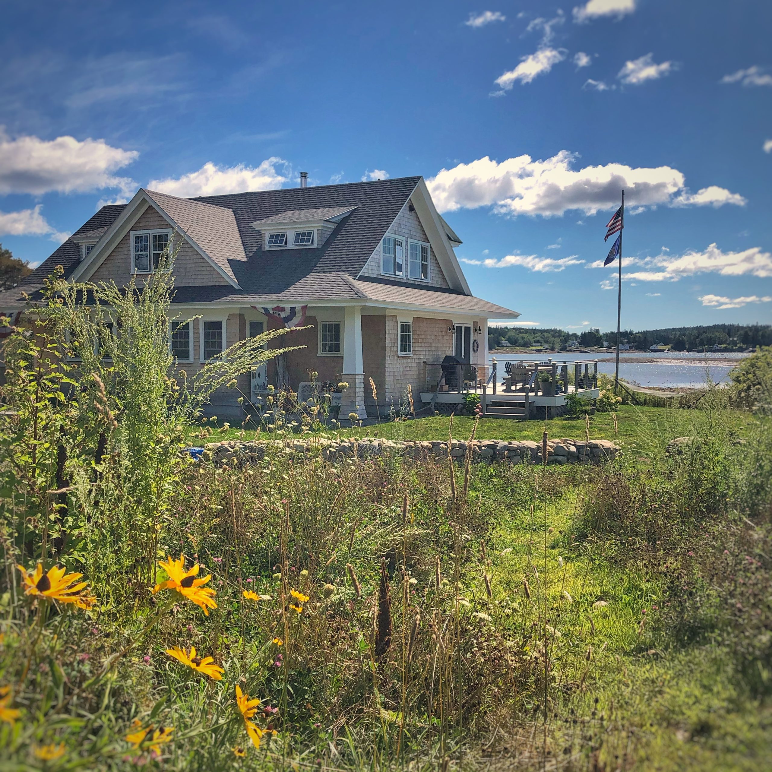
Our home is situated perfectly between the shoreline and a small meadow.
On a beautiful summer day, in one direction the view is marsh grass, cattails, soaring sea birds, and blue ocean stretching to the horizon.
And in the other, tall meadow grasses and wildflowers sway gently in the breeze, bees buzzing from bloom to bloom.
You can read more about our natural meadow in my blog post Natural Landscape: Our Coastal Maine Wildflower Meadow.
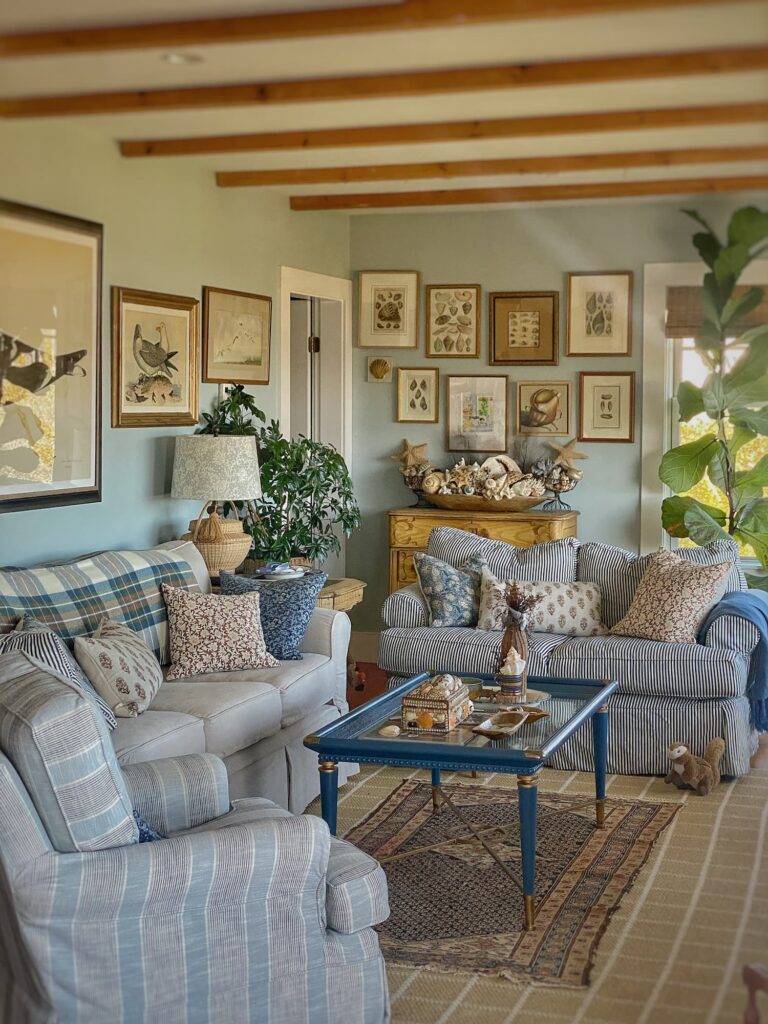
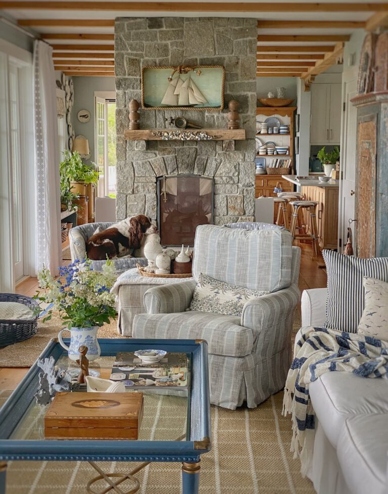
I have designed my home to tell the story of this magical setting.
So that the interior reflects the exterior.
Elements from outside finding their way inside.
Blues and tans, the colors of ocean and sky, sand and rock.
Seagulls perched in the living room.
A sailboat in a window appearing to glide by on the water.
A fireplace made of stone unearthed from the property.
And now, the primary bathroom a mix of meadow and marsh.
But, it has taken a while to get there.
Inspired by a recent find when out antiquing with my friend Ann from Dabbling and Decorating, I spent the week working on the shower/toilet room.
I am excited today to share my progress with you!
The Upstairs Baths
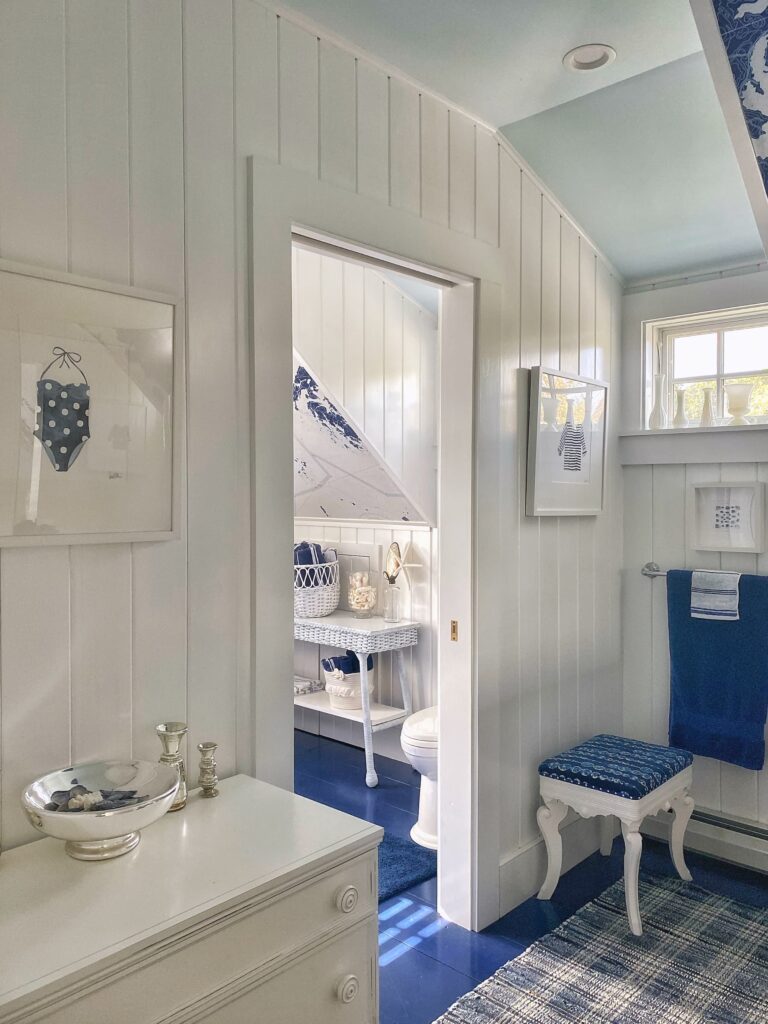
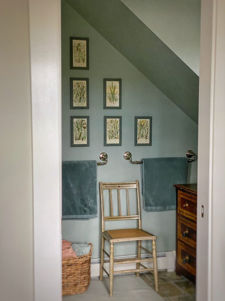
The floor plan of the two upstairs bathroom is identical — both are tucked under the eaves, with slanted ceilings and two rooms separated by a pocket door. One is private, for the toilet and shower/tub, and the other is communal, with sinks.
But the similarities stop there, as they have very different vibes.
The hall bathroom is bright, with south-facing windows and crisp white-painted tongue-and-groove paneled walls. The floor is also wood, painted a deep blue to match the tiled tub surround.
Custom-designed wallpaper — nautical charts of the local waters — highlights the slanted ceilings.
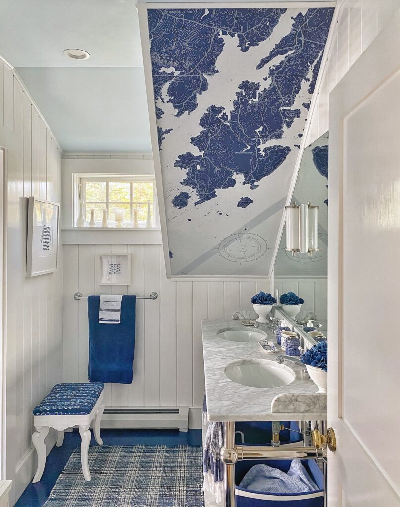
You can read all about this bathroom in my post Chart Your Way to A Classic Coastal Bathroom
This bathroom is very much grounded by a sense of place.
Let’s see how the primary bath is the same, but in a different way!
The Hard Finishes
I picked out the hard finishes — tile, flooring, cabinetry, countertops, and fixtures — for the home’s baths long before we moved in.
I had a strong design visions for both the downstairs and upstairs hall baths.
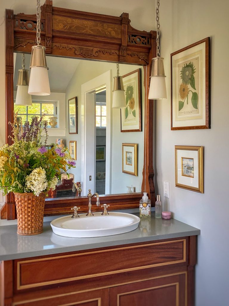
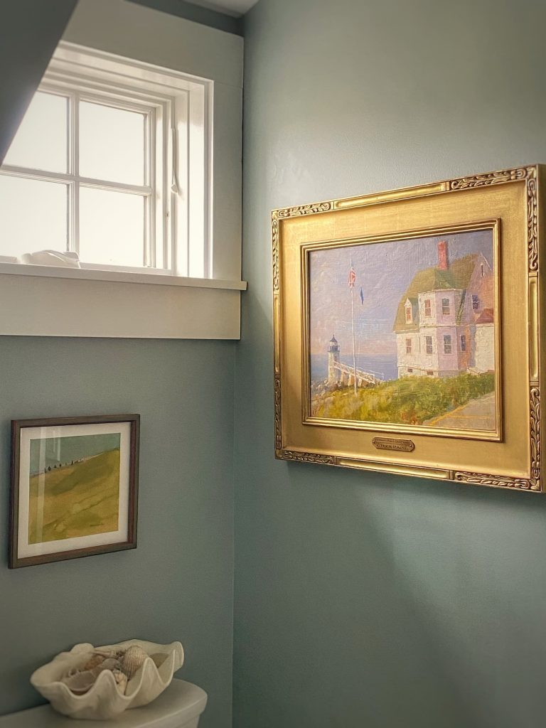
For the primary bath, I fell in love with an antique mirror at a consignment store in Maryland and a tiled coastal scene for the shower.
But I started with no overarching vision.
Same for the primary bedroom, where I had just the antique cottage bedroom set that I loved, but no real plan.
Design Surprises
This has proven to be both a positive and a negative. I have struggled pulling both these spaces together. It has been a slow process and I have to admit I have stumbled a bit.
But on the flip side, it has also been interesting to see where the design process has led me. And I have, at times, been a bit surprised by the direction things have gone!
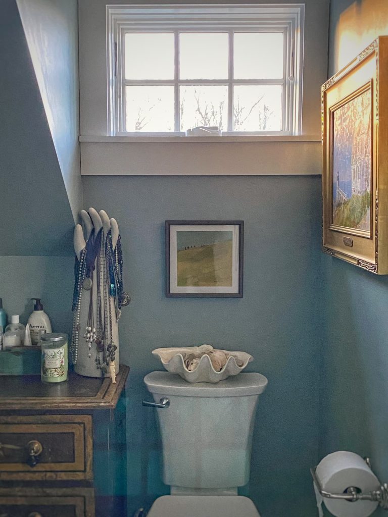
I never expected, for example, I would end up with a teal green and blush pink bedroom and bathroom! But it works, and I love the color combination.
In the bathroom to go with the antique mirror, I had custom cabinetry made. Surprise! It is darker wood and more formal than I would have thought I would choose. But it is gorgeous .
And the other surprise — a gray green quartz countertop that goes with the tile I chose for the shower.
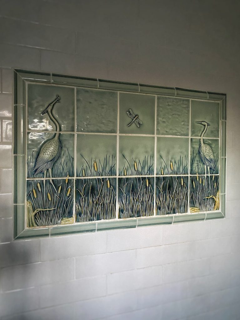
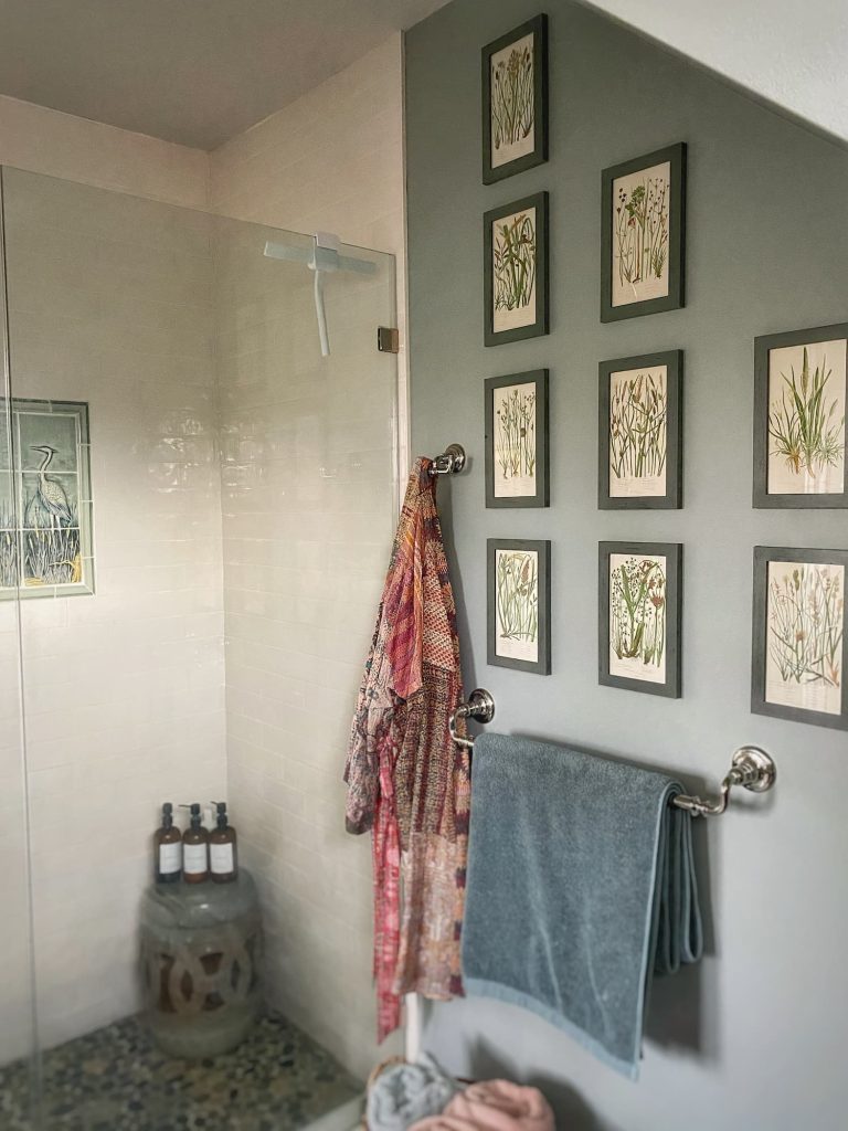
There, for the walls, I went with a classic white subway tile, surrounding a tile “window” scene of marsh grass, cattails, and blue heron. Does this view sound familiar?!
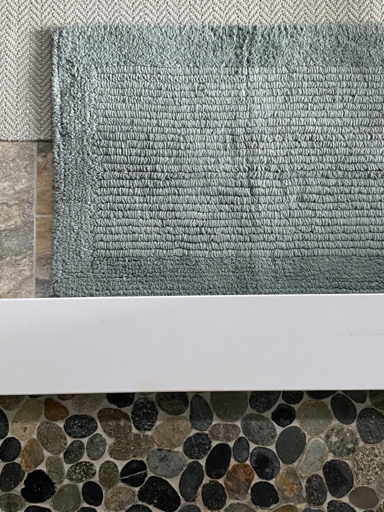
On the floor, a natural pebble, like Maine’s rocky shoreline.
Similarly, the bathroom floor is a ceramic tile that mimics natural stone.
I kept the finishes natural to reflect the marsh and meadow which surround the home.
I added an antique cottage dresser with a dark faux wood finish, that coordinates with the cabinetry, and hung some artwork.
While I loved all the individual elements, and they related well to each other, the space just didn’t feel finished. It was just kind of blah.
Something was missing to pull it all together.
The Walls
That something, I decided, was the walls.
The Dilemma
During the build process, I had also been asked to choose paint colors long before I moved a stick of furniture into the home.
I confidently chose all my colors, except for the primary bedroom and bath. This is a fairly large room with a vaulted angled ceiling. There is no door between the sink area of the bathroom and the bedroom. I felt everything — walls, ceiling, and bathroom — needed to be painted the same color.
The color I settled on was again not typical for me — Benjamin Moore Wickham Gray. It is a pale blue green gray. A chameleon color that sometimes looks gray and sometimes a blue green.
I love it when it is blue green, not so much when it is gray. Maybe one day I will repaint, but that would be a big job.
In an attempt to add “that something” to the bathroom, I thought about adding wallpaper. It is hard, though, to find someone to hang it it around here, and, with all the ceiling angles, it was more than I could tackle myself.
I tried a stencil. It looked too 1980’s.
Thought about hand-painting something, but decided I lack the artistic ability.
I even bought blank stamp pads with the idea of creating my own design.
I wanted to bring the idea of the meadow into this space somehow.
The Solution
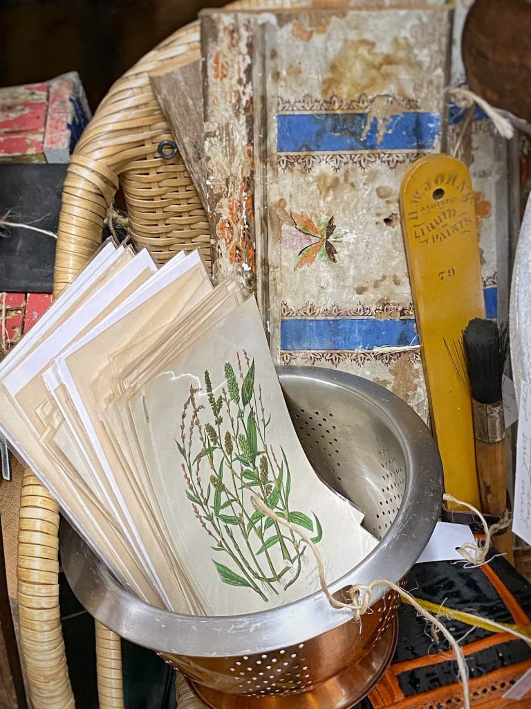
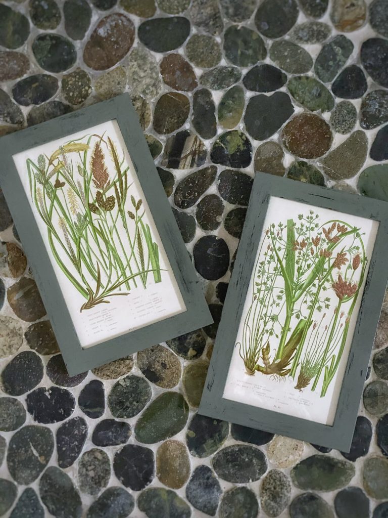
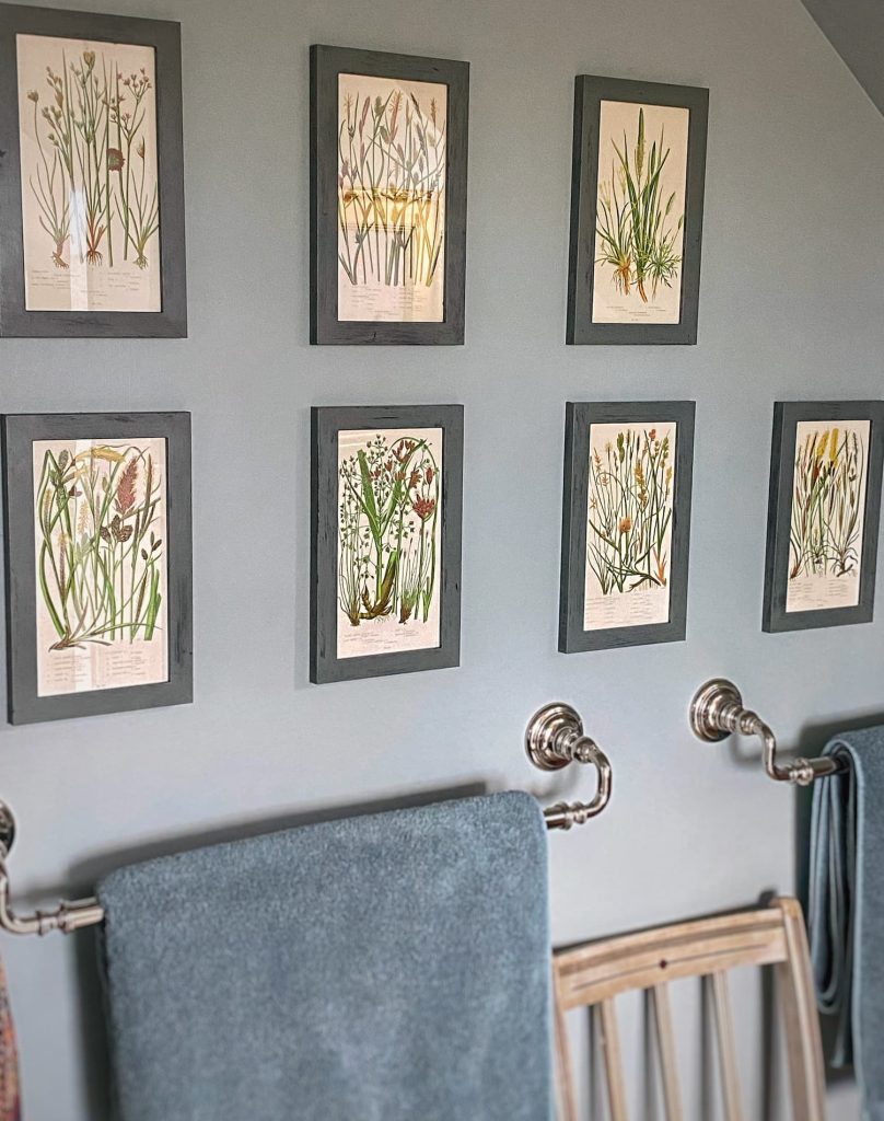
And then when I was out with Ann at Cabot Mill Antiques Mall in Brunswick, I noticed a stack of antique botanical prints — pages from an old book.
What really drew me to these was that they weren’t the usual flowers, but all different kinds of grasses.
The perfect meadow touch to go with the marsh shower!
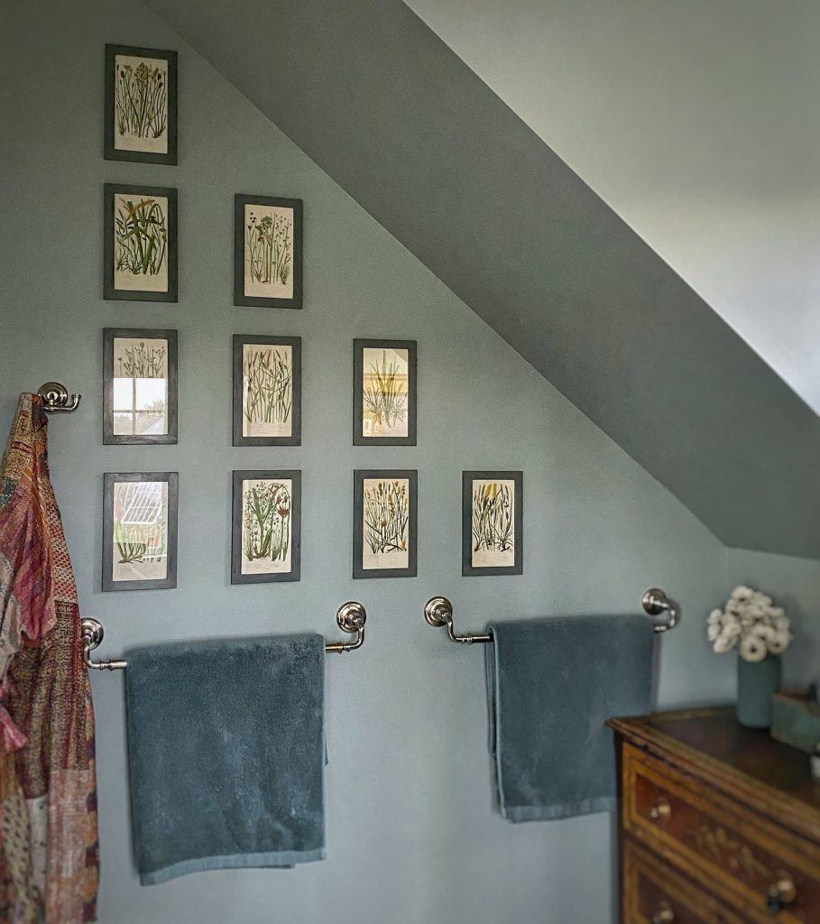
I pictured a grouping of them in the shower room, set against a wall painted a medium tone.
This week I got to work!
I painted the walls Benjamin Moore Castle Walls. Surprise! A gray green with hints of blue. It is a lovely color.
The ceiling is now the color the walls used to be — Wickham Gray.
You know I love a small space painted a saturated color!
I bought the cheapest frames I could find for the odd 5×9 size of the prints, and painted them Rainy Day, a couple shades down the paint card from the wall color.
The frames are not real wood, so the paint did not adhere well to them, but I actually like how the original black color shows through in spots. I enhanced this finish a bit by going over them with a dry brush. Now they have an antiqued look. Surprise!
I love the focal point the new gallery wall creates – both through the doorway and within the room.
The other artwork in the room pops against the darker walls. And the deeper shade also frames the white shower nicely.
Lessons Learned
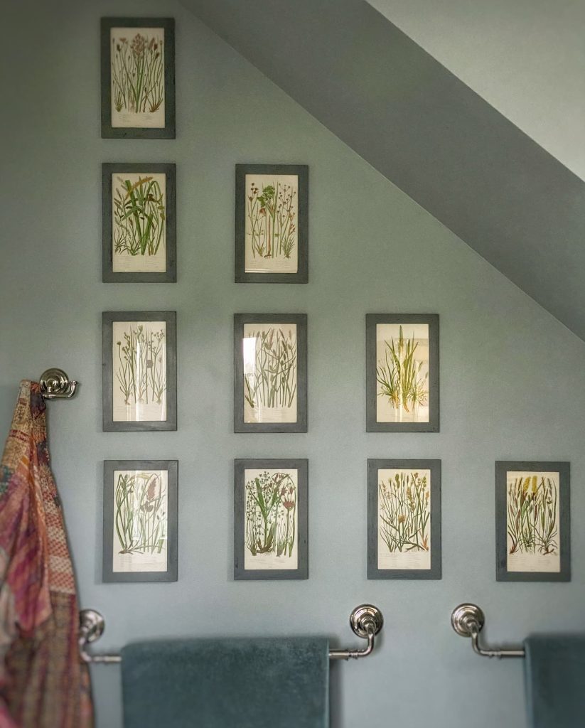
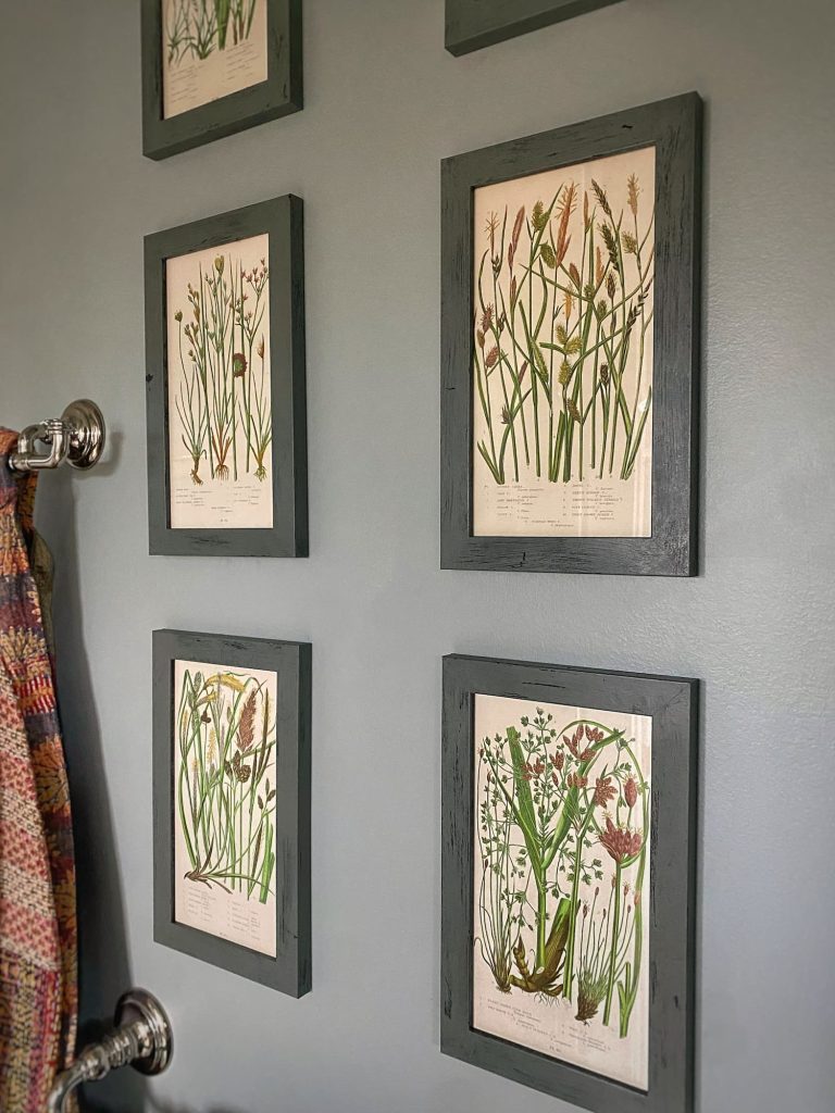
My design journey with the primary bedroom and bath has been a lesson in patience. Allowing the process to unfold and not trying to rush it.
Sometimes waiting for serendipity to provide just the inspiration I need.
I will now have to wait patiently to see how the other side of the bathroom comes together. Maybe I will paint the ceiling in Castle Walls to tie the two spaces together… We will see!
And speaking of patience, I plan on typing up a step-by-step tutorial on how I hung this gallery wall so evenly. I have a method, but it does require attention to detail. And patience.
I will be sharing that the middle of next week.
Surprise!
This Week Into Next

I spent a lot of time this week working on the bathroom.
It is amazing how such a small space can be so much work. But bathrooms are tricky with all the fixtures (painting behind a toilet is zero fun), and this room had the addition of all those angled ceilings.
I am a careful painter, but I am a messy one too. I get it all over me. And I hate washing brushes and rollers. Honestly, sometimes I just throw them out.
So I am glad to have this project done!
Now I have the mudroom to address, with another ceiling to paint…
A little Ina
I entertained myself in the evenings this week watching Be My Guest with Ina Garten on Food Network/Discovery app. This is such a delightful show! Ina invites a celebrity guest to spend a day with her in her gorgeous barn kitchen cooking, eating, and chatting. They always end with a drive in Ina’s convertible to a nearby Hamptons destination — maybe an antiques store, a historic home, or just for a cup of coffee on the beach. Ina is so humble, and of course her guests — Laura Linney, Stanley Tucci, Nora Jones, Erin French, and others — are always thrilled to join her.
I can’t wait for Ina’s memoir, Be Ready When the Luck Happens, to be released on October 1!
A little deVol
I have also been enjoying perusing the book The deVol Kitchen: Designing and Styling the Most Important Room in Your Home.
With chapters on color, antique furniture, lighting, accessories, and finding inspiration, there is so much to gain from it to enhance all areas of your home. And I love the story of how they came to be.
Plus, bonus, the images are total eye candy!
SHOP:
A lot of cleanup
The crew came to do the final (I hope!) cleanup from the multiple floods we had over the winter.
I know we are lucky that we had no damage to the house from the storms, but the seaweed and debris on the lawn was no joke.
Additionally, with all the rain we have had, the waterside lawn is a mucky muddy mess. At least some of the ruts and piits are filled in with dirt now, so hopefully the standing pools of water will soon dry up.
And I won’t have to use the dog shower every time M&C come in from being outside!
A hopeful sign is that the marsh grass is sprouting on the shoreline. Mother Nature does renew herself beautifully!
A little time In Zoe’s Kitchen
It is cauliflower week in Zoë’s kitchen.
Tomorrow she is sharing recipes for a cauliflower galette (never had it) and spiced cauliflower nachos (so yummy!).
That’s it, friends!
See you again sometime in the middle of next week!

Questions, comments, or just want to say hello?
I’m always happy to hear from you.



Love the idea that the interior reflects the exterior of your home. The finished wall looks so great!
Hi Zo! Always my philosophy here! The outside is just too good to ignore!
Molly,
Love how the bathroom came out! The gallery wall is fabulous!
I find decorating a home is a fun process. I am constantly trying to improve ours. Just saw some pictures from my husband’s phone. He was featuring our 14 month old grandson. But what hit me is how great the kitchen looks. We are off to the Netherlands next week. Hope to buy a few pieces from Royal Delft store. If my husband does not complain! Already told him where I want to hang a piece here at our cottage in Ireland. .
Hi Kathleen! Yes, I definitely enjoy the process too. This space had me stumped for quite a while, though. You can imagine my delight when I saw those botanicals! And isn’t wonderful when our homes are a beautiful background to daily life — and photos of grandchildren! 😉 My daughter and her family just returned from a trip to the Netherlands. It was so green and lush! Enjoy!
The prints are absolutely perfect and I love how you framed them!
Thanks, Jane! I am so happy with how the cheapest-frames-I-could-find turned out! 😉
Love the colors in the bathroom Molly goes perfect with the marsh and I can see the color difference based on how the light hits it…green vs grey. Looking forward to the mudroom project. Enjoy the week hopefully nicer than today.
Hi Joyce — Thank you! It was so tricky getting photos, between the size of the room, and the small window, with what little light it afforded, casting shadows on all the angles of the ceiling. This is one of those cases when it really is so much better in person. A little disappointing after all the work I put into it, taking photos, and writing the blog. The important thing, of course, is that it looks wonderful in person!
I love your.energy and how.you approach things to get a.project done. but I mostly love your cozy house
Thank you, Natalie! Believe me, I was pooped after climbing up and down and crawling all over bathroom for two days!
Wow, that bathroom is really something now. Those botanical prints are really beautiful and they make a stunning gallery wall. I will have to read about how you hung them so perfectly. You will have to see how I hung some of mom’s tiles in the basement! Yikes! But I didn’t want to do several holes for every tile which is my method so I just cock my head at different angles. : – ) Steve could do it but he sometimes gets frustrated! I’ll head over now and read about cauliflower recipes!
Amy
Thanks, Amy! Happy to have this little space finally pulled together! I love it when inspiration strikes! I have always been patient and methodical about hanging things on the wall. It makes such a difference!
Molly your bathroom update is beautiful. I love your design philosophy of having the interior reflect the exterior of your natural surroundings. Your descriptions are poetic. I am so glad that someone thought to save those pages from that old book. Those botanicals were waiting for you to give them a new home. You are such an inspiration. Thank you for sharing your beautiful home and the great state of Maine.
You are kind, Suzie. I so appreciate your support through the years. It means a lot to me! After all the ideas I had been through for this space, I was thrilled to have inspiration strike when I saw the botanicals!
I love the choices you made in your bathroom. Greens and blues are my favorite colors. The gallery wall is perfect! Ina Garten is such a wonderful cook and a lovely person. I have never been disappointed with any recipe of hers. I saw part of the episode with Jennifer Garner but didn’t realize it was a series. I will try to find it and catch up.
Thanks, Vicki! I love blues and greens too — the colors of nature! I love how unpretentious Ina is. I haven’t seen the episode with Jennifer Garner yet. She is another one who is so down-to-earth, despite her fame. There are actually three seasons of the show! You have some fun watching to look forward to!
Molly, it looks amazing! I love the botanical prints, they bring your beautiful flowers and grasses from outside in. Sometimes design is like that, it just needs the perfect piece or in this case pieces to bring it altogether.
Have a wonderful weekend,
Thanks, Elizabeth! I was so happy when I found these grass botanicals. It solved a design dilemma that I had been struggling with for years! Hope you are enjoying your weekend too!
Really enjoyed reading about and seeing the refresh of your bathroom. Looking forward to your tutorial on how to hang a gallery wall with precision spacing. It truly pays to be patient as you design and layer a home that tells your story. You’ve motivated me to show some love to my own primary WC…after seeing the tutorial. Thanks again for another peak inside your lovely home.
Enjoyed another wonderful visit to your coastal cottage. Love the primary bath refresh. You’ve motivated me to give some love to my own WC, but first I need to see the tutorial on how to hang pictures so precisely. It really is true that it takes patience and living in a home for a while to layer and collect so it will tell your story. You’ve done such a good job of that. Mudroom refresh? Oh my it’s perfect but I look forward to seeing what you’ve come up it. See you next week on my virtual visit to Maine.
Thank you for TWO comments today, Julie! 😉 A reminder that they don’t show up on the blog until I approve them. Thank you, I was so happy to find these botanicals. They were just what the space needed. And the wall color is such an improvement. I really am happier with color in my life. (And I don’t feel that a pale gray, as lovely as it might be, constitutes real color, ha!) Not really a refresh to the mudroom, but just some additions and one change I have been wanting to make. Tutorial coming later this week!
They came out so nice, Molly; I love them. So worth it!
Hi Ann! So glad to finally have dealt with the walls in this part of the bathroom! That was such a fun day with you!
Love how your bath turned out, Molly! Wickham Gray is a wonderful color … and can we talk about your towels?! Wow. It’s so funny how they caught my eye and I kept going back to take another look. You’re making me rethink my white towels. Love Ina’s Be My Guest show format. I see some new episodes on my DVR so I may entertain myself with them this week. Thanks for the idea. DeVol’s book is fabulous, right? Everything about them is fabulous. My next project might call for a DeVol kitchen … ha! xo
Hi Juliet — Thanks, Juliet! This space was so hard to photograph — small and dark. It does look so much better in person! And the towels are from Target! I can’t do white towels — they just get dingy looking. deVol kitchens are fabulous! Are you talking about your new cottage?!