Creative Wall Decor Part 2: Non-Art Displays
In part two of our series on wall decor, let’s chat about getting really creative and using non-art pieces to express your unique style!
Decorating Your Walls
I hope you enjoyed last week’s post on adding personality to your home with art and gallery walls!
Did it make you think about how you decorate your walls?
And maybe try something new?!
If you missed it, you can read it here!
Before we get started with this week’s subject — non-art displays– I want to tell you a little story about how I recently applied some of the things we talked about last week to our home.
A Stitch in Time
Last Sunday, after our big Saturday snow, I headed out to one of my favorite antiquing spots, the Wiscasset Antiques Mall. With over 100 dealers, I can usually find what I am looking for there. And often something more! 😉
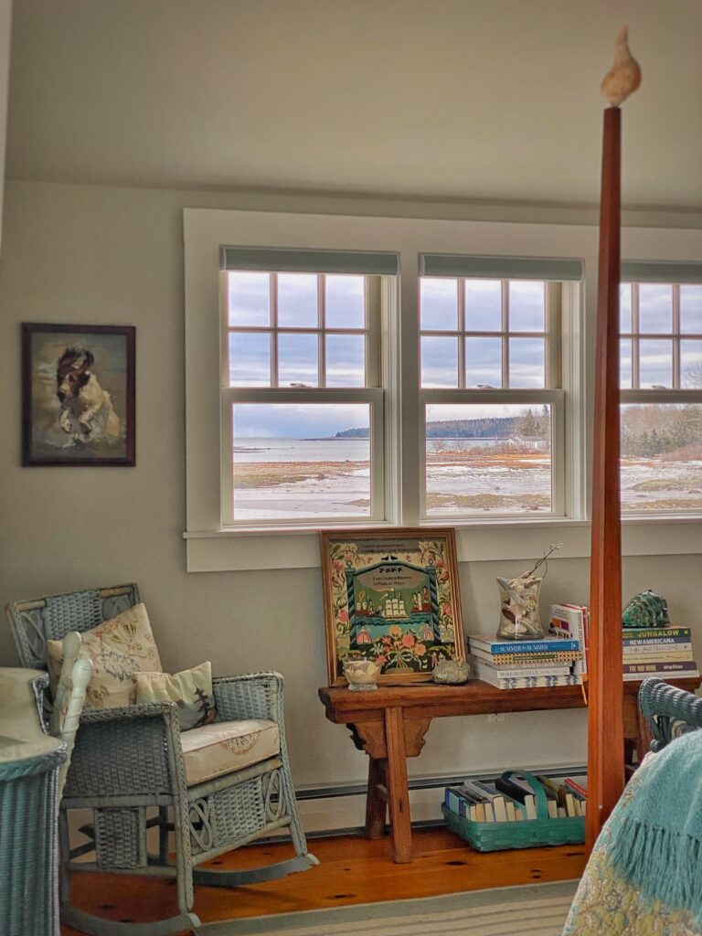
This time I was on the hunt for a piece of artwork for the primary bedroom. There is a bench underneath the windows opposite the bed. I have a couple stacks of decorating books there and I wanted a third element with more height.
Yes, as we talked about last week, I wanted a piece of artwork to casually lean against the wall!
I didn’t know exactly what I was looking for. This is often the case when I go antiquing. I have a general idea, but wait to see what inspires me.
This is especially the case with art.
On Sunday I slowly perused the many booths, waiting to see what spoke to me.
And I was surprised!
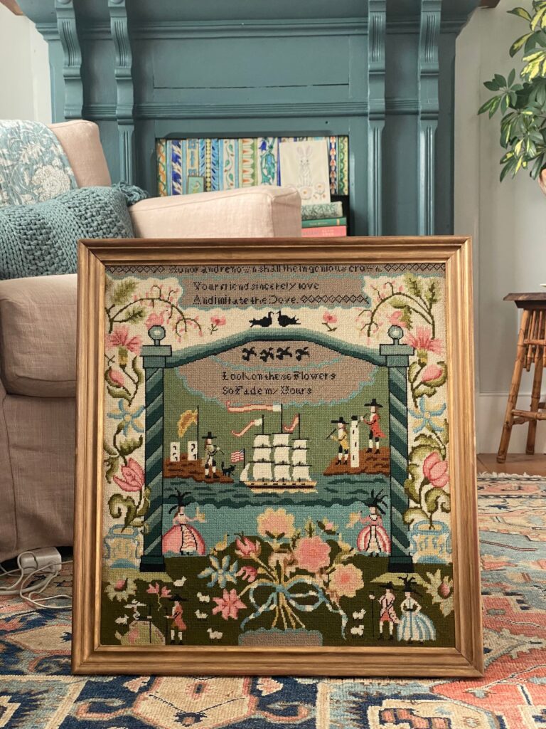
The piece that came home with me is a vintage framed needlepoint reproduction of an 18th century sampler. (That’s a mouthful, haha!)
I did hesitate before buying it — was framed needlework too “80’s”?? And not in a good way?
Ultimately, though, I went with my gut. I knew the colors would be perfect, and loved the stylized design.
My mom was a needlepointer, so I knew how much time went into creating this piece.
The fact that it has a sailing ship theme sealed the deal for me!
Just as I recommended in last week’s post, I kept my mind open and waited for something to resonate with me.
And now that the piece is home, I have to say I love it!
Now are you ready to take your wall decor to the next level?!
What do I mean by “non-art”?
I have a friend who has a beautiful waterfront home filled with equally beautiful and significant art. I always admire her one-of-a-kind pieces. They make such a statement!
My friend and I were talking about our homes once, though, and she said something to the effect “I just hang art on the walls. You create art with your displays.”
It was one of the nicest things anyone has ever said to me about our home.
It was rewarding to have her understand and appreciate one of the ways I express myself unique style.
And you can do it too!
By artfully displaying ordinary objects such as plates, baskets, architectural pieces, and even fish moulds, you can create something that is greater than the sum of the parts.
You can make art out of the everyday!
As with regular art, think outside the box! You can find items at your local thrift or antiques store.
Or even your attic!
For this kind of display, number is key — the more the better!
Flex your creative muscle and have fun!
Here are some non-art displays in our home!
Let’s Dish
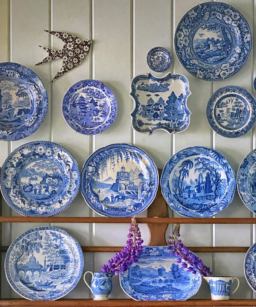
A plate wall is a classic form of non-art wall decor.
You can take it up a notch, though, by displaying your dishes in a more creative way!
On the Fireplace
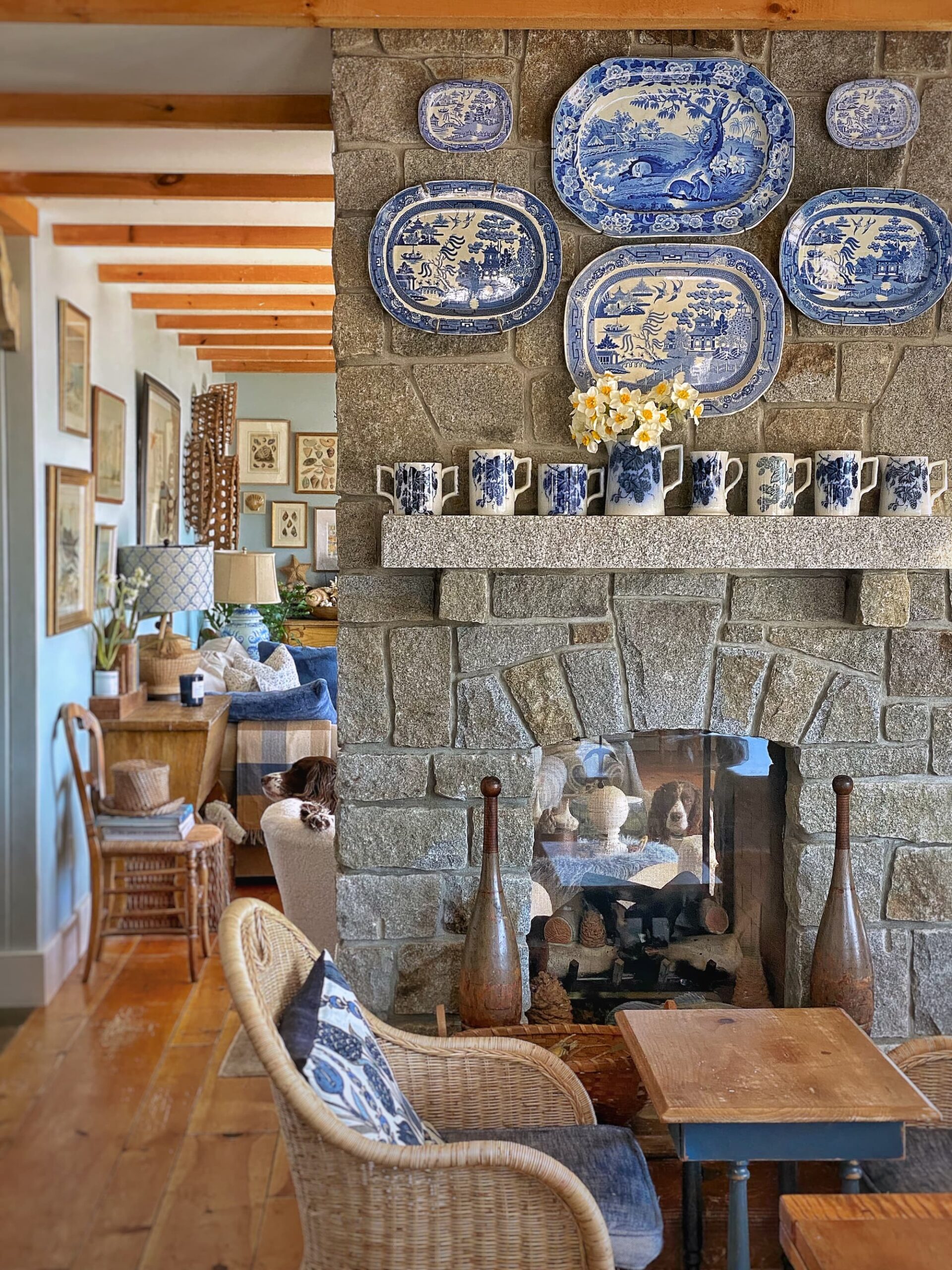
In my blog post I Am My Mother’s Daughter, I wrote about the pieces of antique blue and white transferware from my mother’s collection which now grace my home.
I have them displayed primarily in two different spots.
The more traditional symmetrical arrangement is in the dining room.
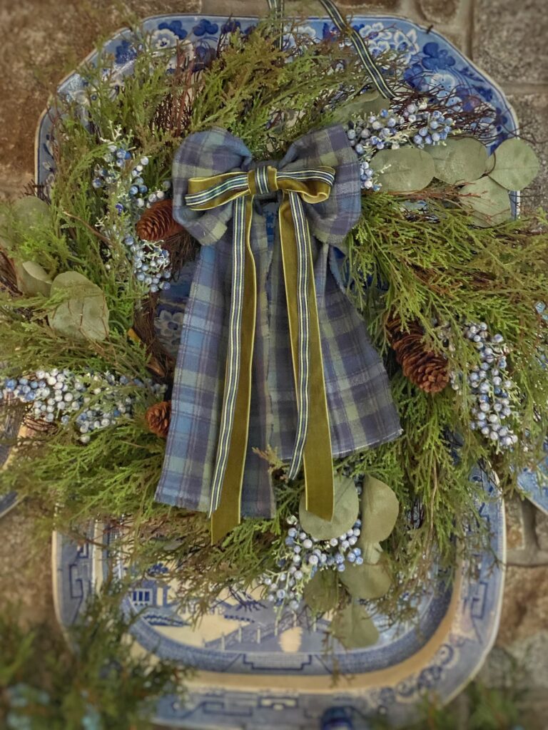
Hanging this arrangement on the stone fireplace, though, takes it from everyday to wow! The contrast between the rough and rugged stone and the smooth and refined platters enhances each.
I get questions on Instagram about how I hung the platters on the stone surface. In a small feat of yankee ingenuity, my builder helped me fashion hooks from old metal hangers. One end has a long “tail” that fits in between the stone and the ceiling board at the top of the fireplace. A wire runs from the hook and attaches to hangers on the back of the platters. The concept is similar to a Victorian picture rail.
The platters are securely hung.
That said, I don’t touch them.
In the Front Hall
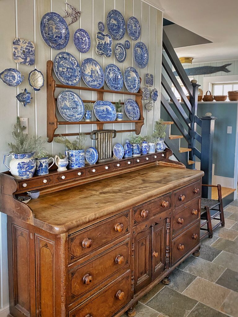
The larger display of blue and white is over the sideboard in the front hallway.
In the beginning all that hung here was the shelf with the plates.
I then added the row of plates on the wall above and the small pieces on either side. I kept the arrangement symmetrical.
It stayed this way for quite awhile.
Until I was gifted the bird made out of a brown and white plate.
And that was all the inspiration I needed to make this arrangement more interesting!
I added a few more dishes on the upper right and tucked the bird in on the top left. I love it when “one thing is not like the others” and an arrangement is just a little off.
It has more energy and catches your eye.
You can read more about symmetrical and asymmetrical arrangements in last week’s blog post!
And check out my friend Ann’s post on Dabbling and Decorating “Blue and White Asymmetrical Vintage Platter Wall | Design Yours Today” for more inspiration!
A School of Fish
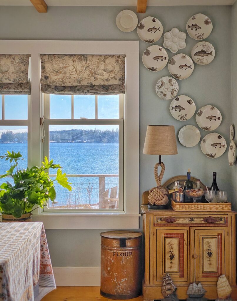
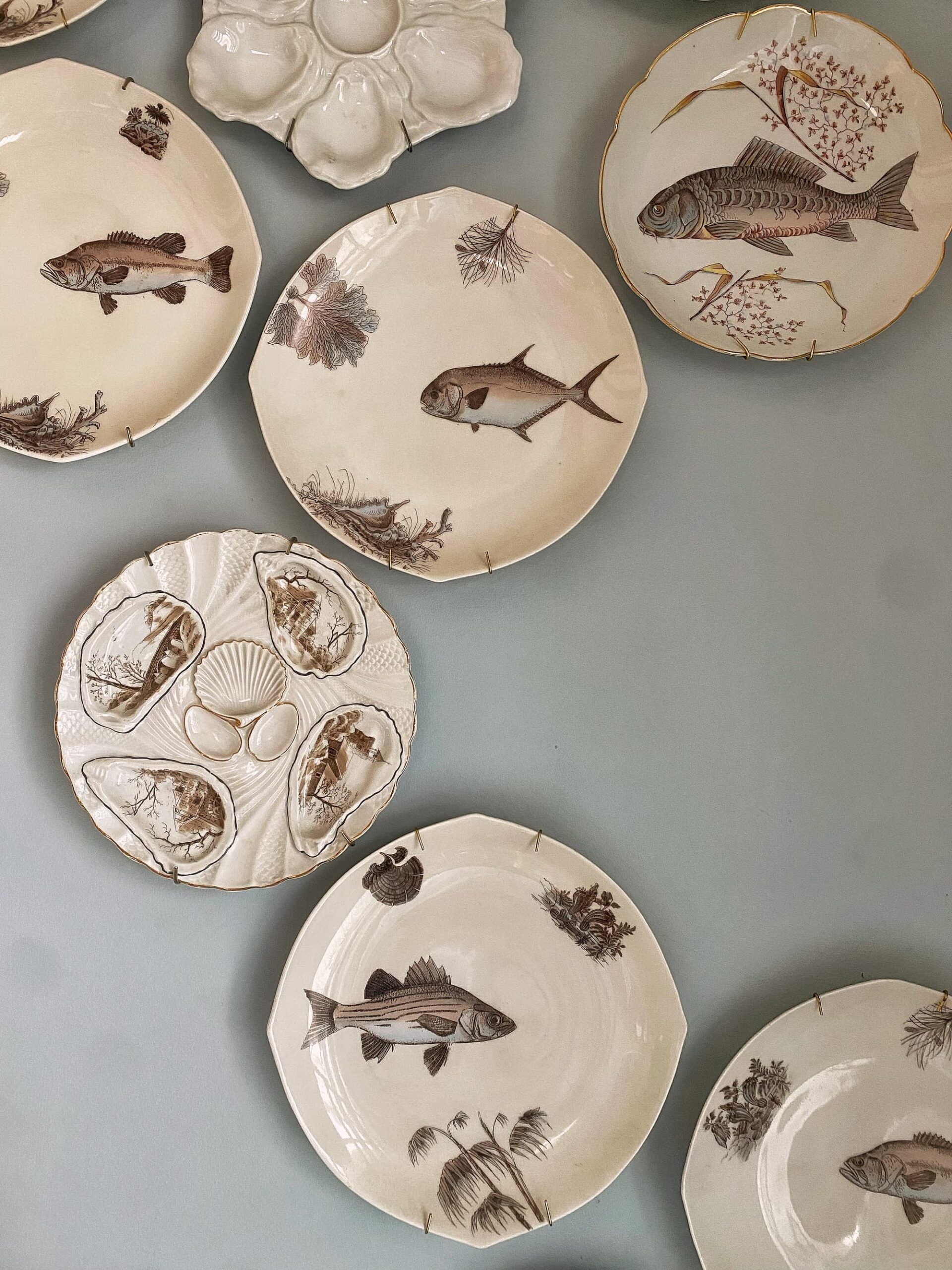
As much as I love my mother’s blue and white dishes, my favorite plate wall in the house is the arrangement of vintage Limoges fish plates in the dining area.
I purchased the plates at a favorite local store. This was early days in our home here and things were evolving fairly quickly.
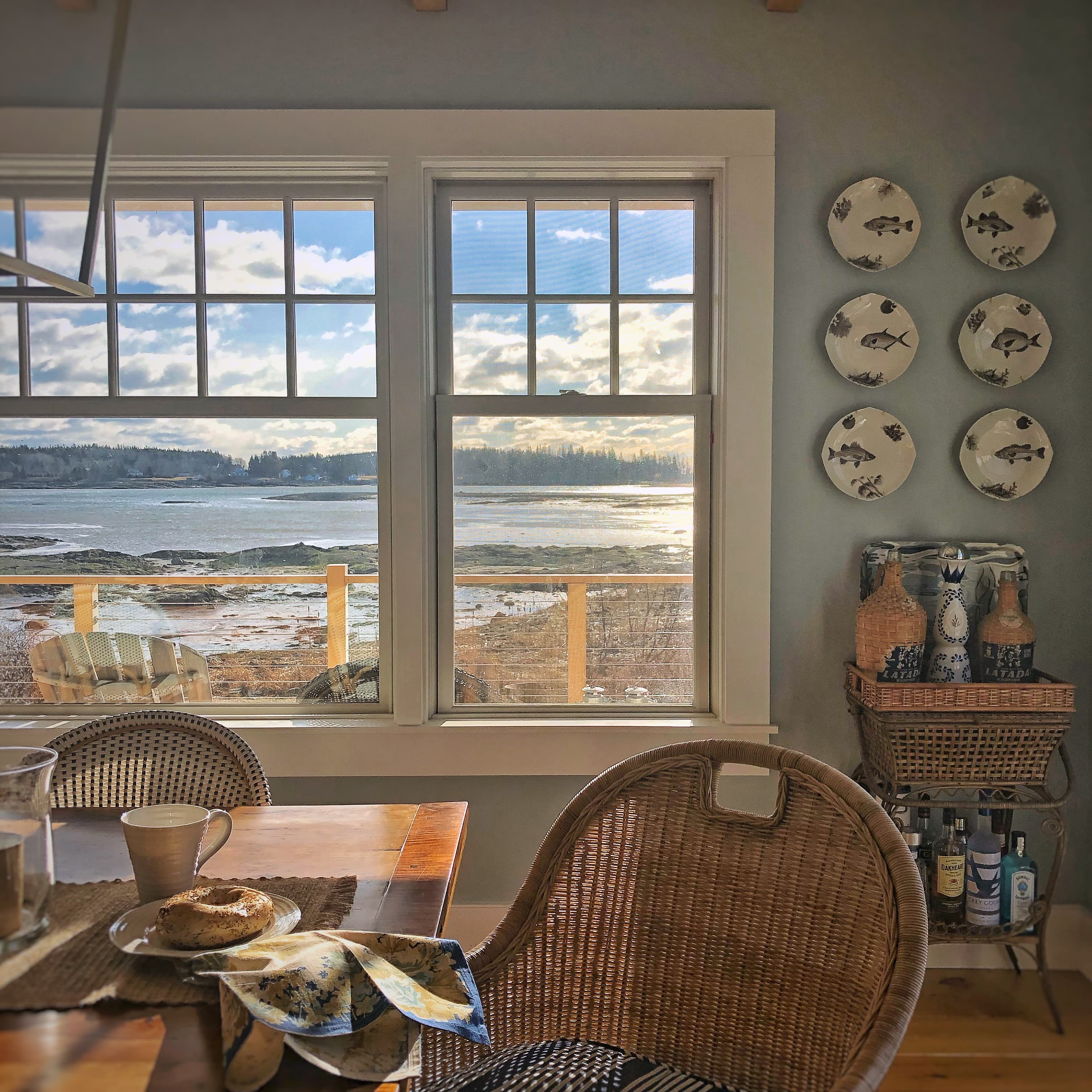
I first went with a traditional symmetrical arrangement — two rows of 3 plates.
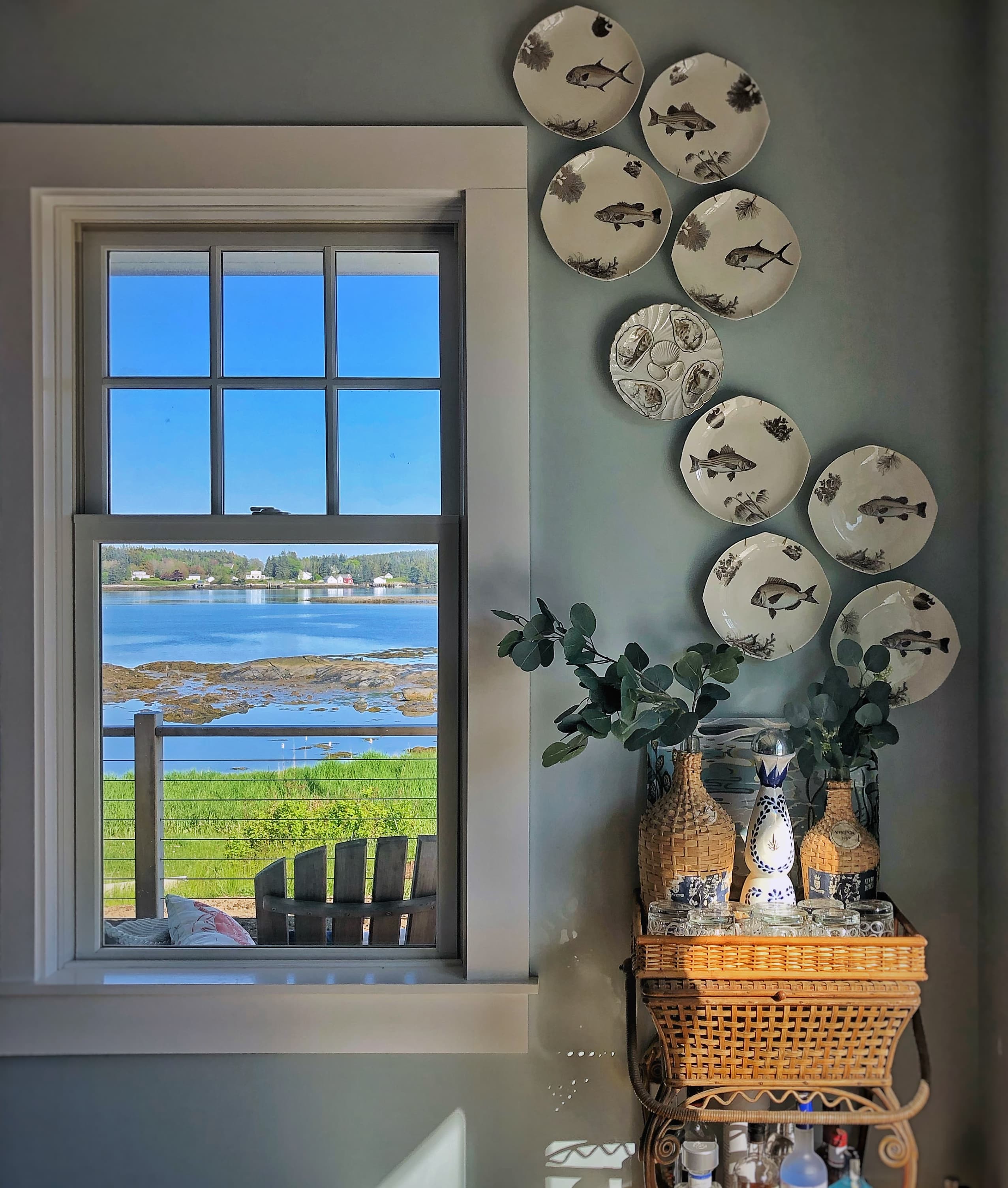
Several months later, as I gained confidence and started to flex my design muscle, I rearranged the plates into an asymmetrical design.
Over the last couple years, I have gotten even bolder and added a few additional plates — a couple oyster plates, a different fish design, and some solid white to give the arrangement some “breathing space”.
I have extended the display over the window and wrapped it around the corner.
I talked in my previous post about different methods for hanging wall decor. Because this arrangement has grown and changed over time, it is one that I have just eyeballed when hanging new plates.
Yes, that means that there are a few nail holes hidden behind the plates!
But that doesn’t bother me.
Not having a plan has created an organic flow to this arrangement — like a school of fish swimming through the water.
Or, some have said, air bubbles rising to the surface.
Proof that arranging these plates in this manner inspires people to think more than a traditional symmetrical layout!
A note here on hanging plates: I am a traditionalist and use those spring-loaded metal hangers. I know they are reliable and I don’t really even notice the clips that secure the plate in front. That said, I know many people are now using the adhesive discs that attach to the back of the plate. I actually just bought some to use to hang some spongeware plates on the back of the corner hutch. I will let you know what I think of them!
Something Fishy
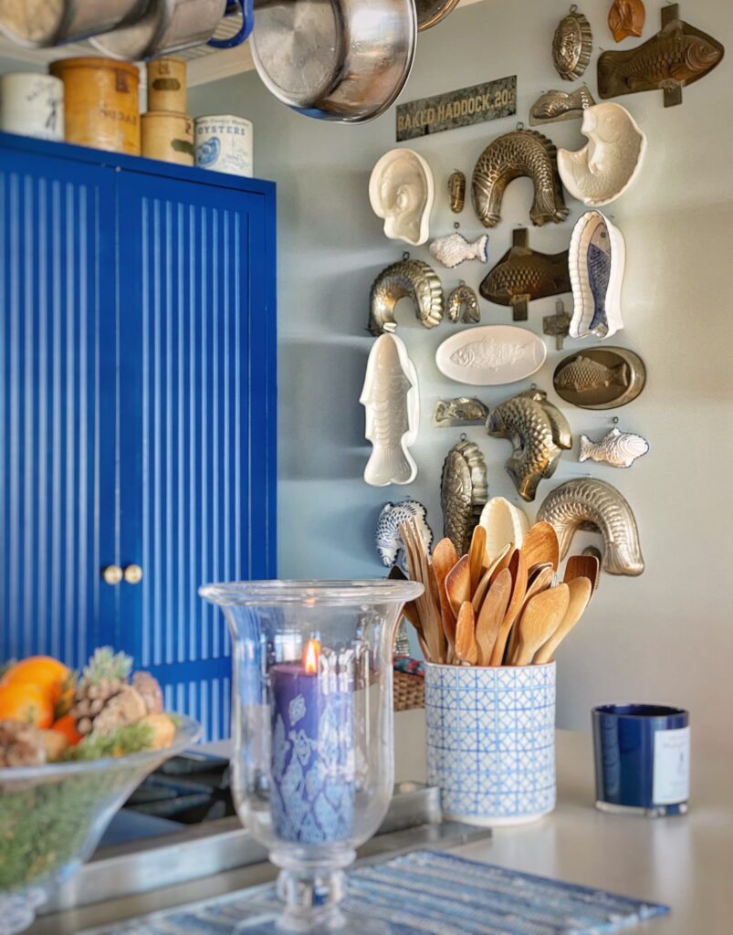
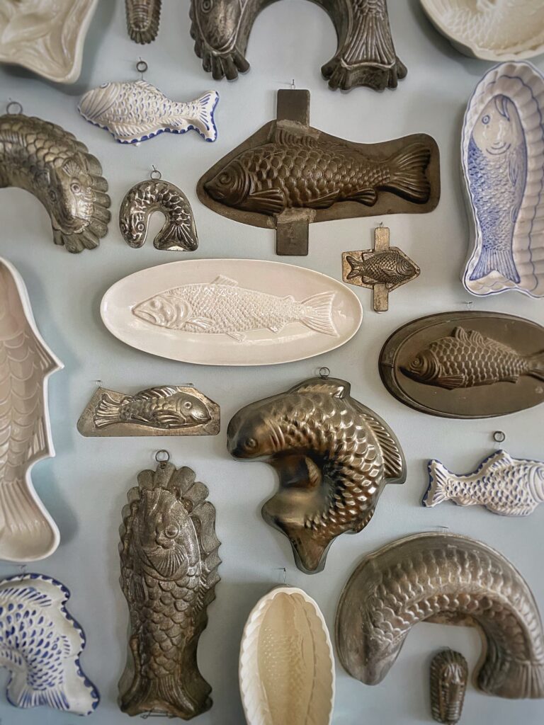
My collection of fish moulds began as many do — with the purchase of a single item.
And then another. And another.
Then suddenly I found myself seeking them out and purposely growing my collection.
Eventually people started to give them to me, because they knew I was a collector.
When I first hung these on the wall, my collection was smaller, and I arranged them in a relatively symmetrical shape.
As I am wont to do, thought, one day I looked at the expanding collection, and the display just didn’t work for me. So down they all came!
This second time I arranged them, I used the “lay out on a flat surface” method of arranging the moulds. I touched on this briefly in part 1 of this blog series. With all the different shapes and sizes, it was the only way I was able to corral them into some kind of order.
I chose a rectangular shape with with little flares at the top and bottom for some dynamic interest.
The baked haddock sign and one lone copper mold (a lobster), both gifts from a friend, are fun “not like the others” additions!
Basket Case
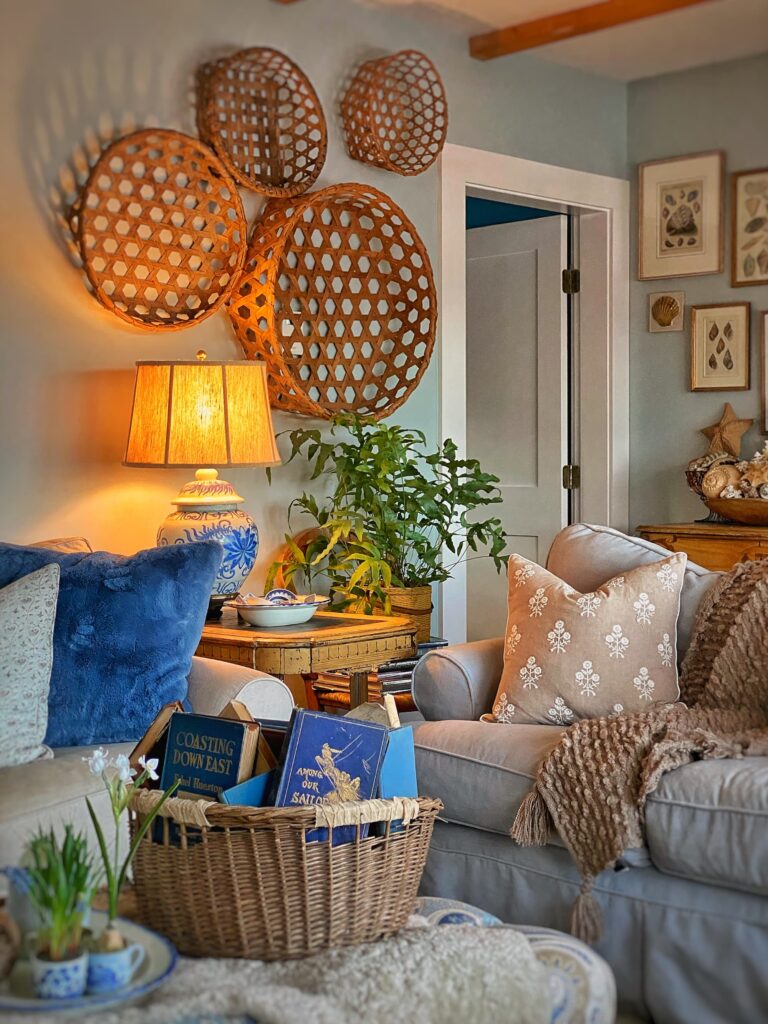
I am a big fan of baskets for the texture they add to a space.
So, even though basket walls were rather ubiquitous for a while, when I saw the largest Shaker cheese basket in a local store, I brought it home and hung it on the wall.
And then I added a few more, because that is how I generally roll…
Our daughter Zoë worked as a cheese monger when she was just out of college, so we have a bit of a thing for cheese in our family.
But also, the baskets bring something different to the living room walls.
As much as I would love to hang some additional art in this area, I don’t think it would be right. Since the eyes are not unconsciously trying to make out the details of an image, the baskets give them a place to rest a bit in a room with otherwise busy walls.
And I think texture is always a good thing.
Again, I used an asymmetrical grouping for a little fun energy.
Architectural Salvage
Architectural Salvage pieces always make for interesting decorative additions to a home, especially a new build like ours.
When hung on the wall they can make for great graphic impact.
The Stairwell
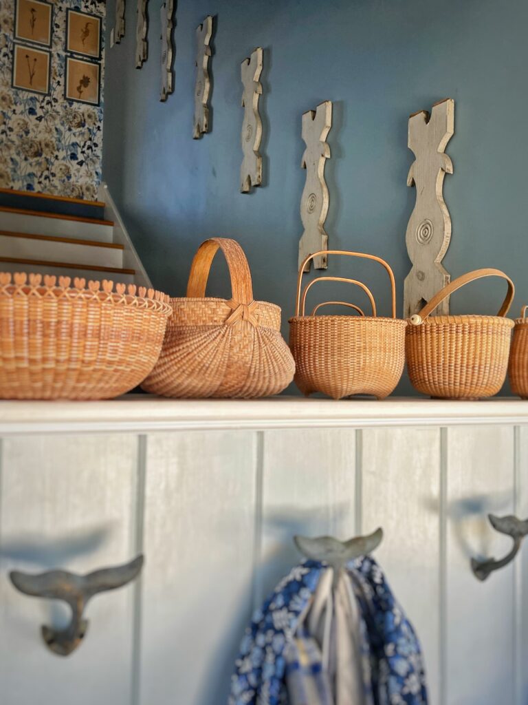
There is a lot going on visually in our home, but sometimes I do crave something more simple.
Such was the case with the stairwell. I knew I wanted something decorative on the wall, but I didn’t want it to be overly fussy.
When I happened upon a weathered Victorian porch railing at an antiques sale, I knew I loved it, but had no idea what I would do with it.
As soon as the dealer mentioned taking it apart, and hanging the flat carved balusters on the wall, I knew exactly where they would go!
Hanging these pieces evenly on the stairs definitely required very careful measurements!
Upstairs Hallway
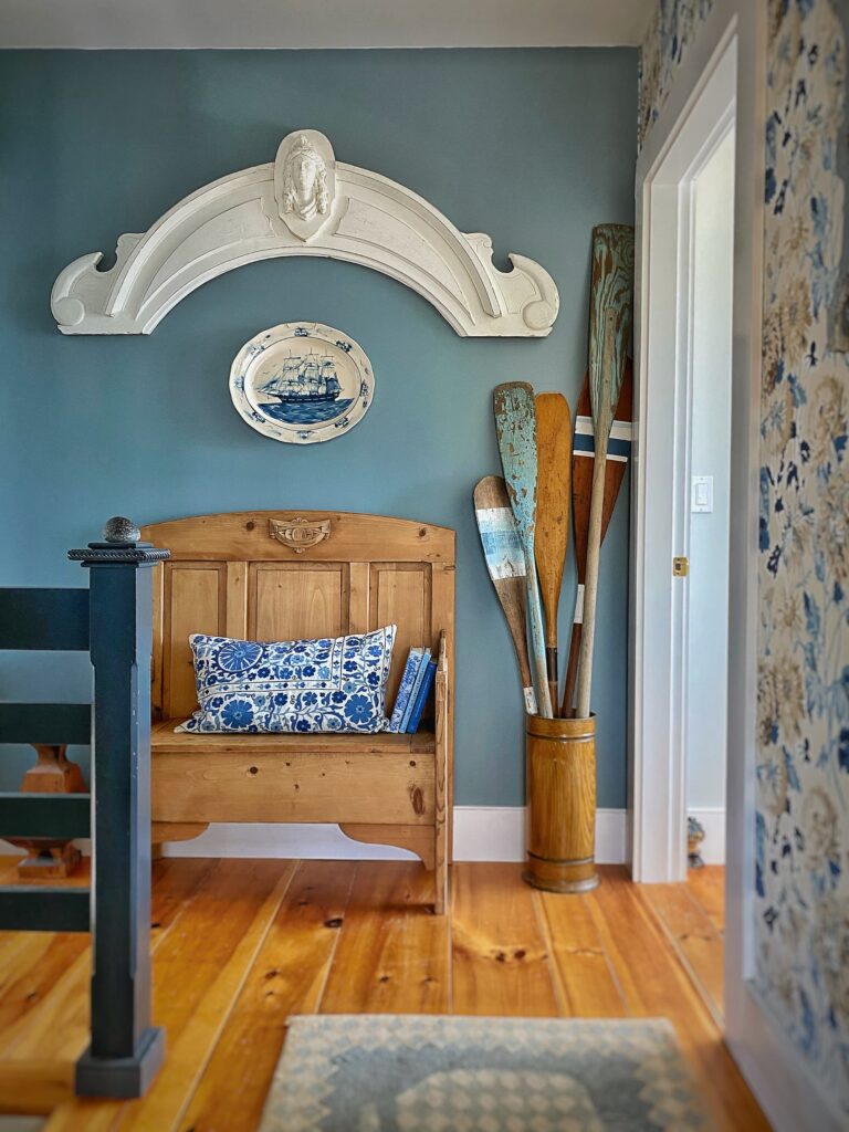
As with regular art, sometimes you need to go big or go home.
This large carved arch hung in the primary bedroom in our previous home.
I almost didn’t move it with us to Maine, but a friend convinced me to add it to the truck.
I am so glad he did!
Sometimes one large piece makes just the right statement!
Out For a Paddle
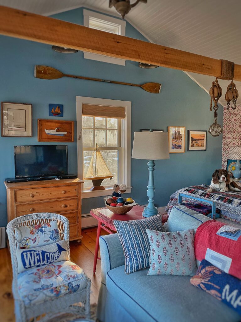
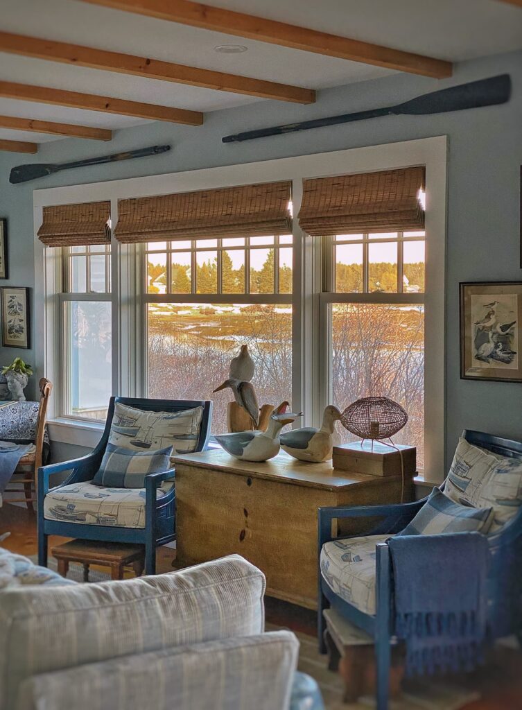
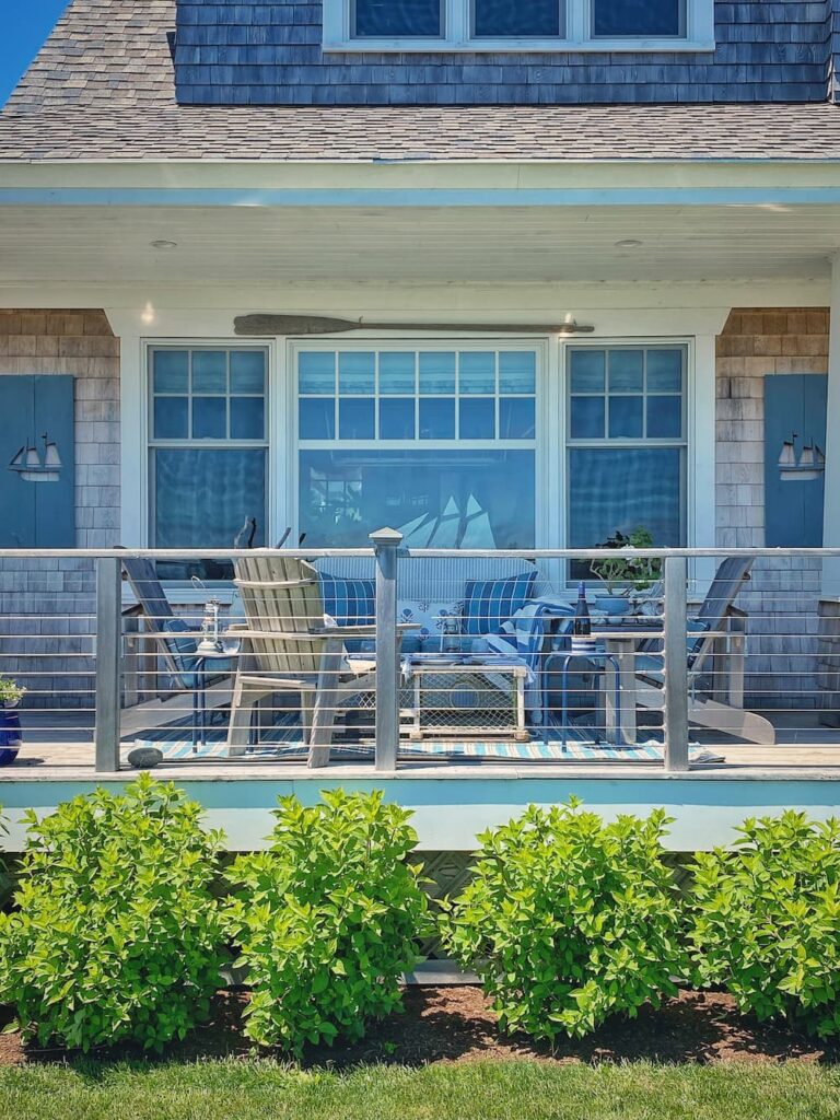
In keeping with our home’s coastal location and theme, I have amassed a collection of vintage oars and paddles.
I gathered a casual grouping of them in a corner of the upstairs hall. (You can see them in the picture of the large arch.)
And others I have hung on the wall — in the guest cottage, the living room, and even on the back covered porch.
The one on the porch actually washed up on our shoreline!
Also note the old blue shutters with the sailboat cutouts I hung on either side of the windows there.
To see more of our porch on a magical summer evening, check out my post Summer in Maine: A Coastal Table Setting on the Porch.
From My Daughters’ Homes
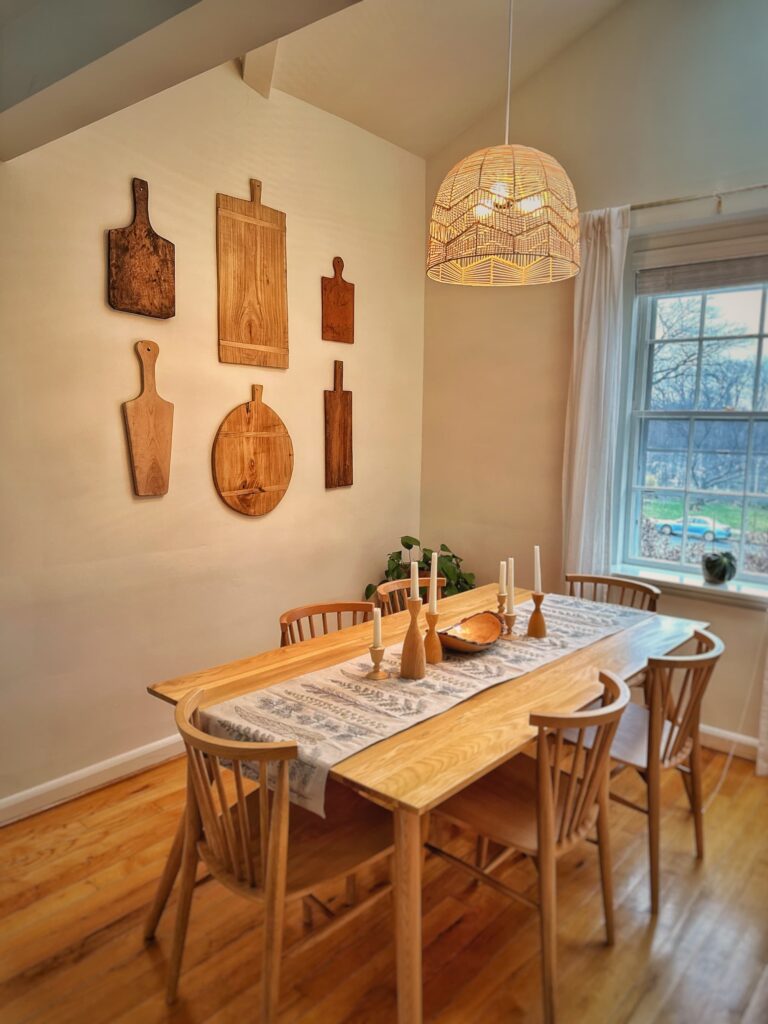
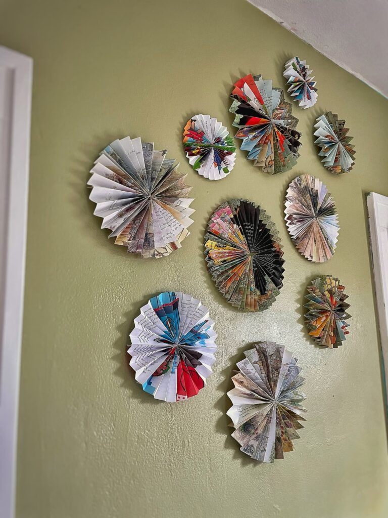
As I did last week, I am sharing here spaces in my daughters’ homes where they each got creative with wall decor!
Zoë, the organizer in our family (and also the former cheese monger), went with a symmetrical display of wooden boards in her dining area.
And I helped Leah, who like me loves color and pattern, hang this asymmetrical arrangement of pinwheels made from pages out of children’s books. The pinwheels were decorations at a baby shower friends threw for her, and now they hang above the changing table in my sweet new grandson’s nursery!
Now It’s Your Turn!
I hope this two-part blog series has encouraged you to look at your walls in a new way!
Hang a gallery wall!
Or a really large piece of art!
Take your plates out of the cabinet and display them on your wall!
Add some texture to the wall with baskets!
Or some graphic impact with architectural salvage!
Turn your quirky collection into wall decor!
Step outside the lines and go asymmetrical!
Include that one thing that is not like the others!
Let your walls reflect your unique style!
I would love to hear what you have displayed on the walls in your home!

Questions, comments, or just want to say hello?
I’m always happy to hear from you.

I have always loved your fish plates that climb the wall in your dining room. Such a clever way to display them! I love the collections of non art on your walls. Your home has so much character! Thank you for sharing your stories with us. I keep my eye out for unique pieces and aspire to provide more character to my house.
Thank you, Brenda! I hope you enjoyed seeing how the fish plate wall evolved over time. Design takes time! Bring home things that you love and your home will be filled with character! Thank you for taking the time to say hello!
All of your collections, and the way you display them, are to die for. My favorites include the arch (so glad you brought it with you), the fish plates, the fish molds, and of course all of your blue and white transferware. Thanks for sharing.
Hi Miche! As you can obviously see, I love to have fun with what I hang on my walls! Thanks for saying hi!
My first reading of a blog! Your Instagram posting inspired me to try . I got there!!!
I hung plates years ago! Adds such a pretty look. Part of my blue and white collection. I have to say I agree with your son in law. Glad to hear someone else thinks like I do about over beds. But I find plenty of other wall space without thosr. I love to collect small pieces of art while traveling. Just had a piece from a trip to Croatia framed. Need to find a place to hang it. Your idea of placing on a shelf great idea. Will see where it ends up! Thank you for the great articles
Hi Kathleen! So glad you found your way here! My mom had walls covered in blue and white platters in their home, so naturally I have them in mine! I also like to bring art home from my travels! I have two watercolors from a trip to Paris years ago and another one from Italy! I hope you will come back and visit my blog again!
Good morning Molly I love all your beautiful collections. So inspiring and love the fish plate wall that climbs the corner💞
Thanks, Ann! We are kindred souls with our vintage collections!
Love how intentional + thoughtful you are with your wall hangings. Between Nana’s blue + white, and playing floor bocce with Granny with the cheese baskets, everything has intentionality behind it!
Thanks, honey! Can’t say my intention was to play floor bocce with the baskets. That was all your husband, haha! The tax hat too!
I loved this post. Great ideas. I love the creativity.
Thank you! I am always flexing my creative muscle in my home! That is my jam!
Thank you for sharing your home and creative artwork…traditional and nontraditional with us. Love the needlepoint and how you’re leaning it against the wall. I like how you’re always thinking outside the box as you style your lovely coastal cottage. I learned what a Shaker cheese basket is….and pinwheels from books as art. So clever. I know you hear it all the time, but your home is so interesting, collected, and tells a story. It may not be very old in years, but it definitely has a soul. I’m already looking forward to next Saturday’s blog.
Hi Julie — Thank you for your kind words. I do believe that this home has a soul and already has stories to tell! I loved the pinwheels that my daughter’s friend made! My daughter was an English major and is a teacher, so she has a real love of books. I am certain that little Jamie will be a reader too!
While I agree with he school of fish and bubbles rising vibe of the fish plates…to mee it looks like a wave about to crest over the window frame. Really love how you and your girls embrace this kind of art. Very inspiring!
Yes! I can see that! And it proves my point even more — that items hung in a creative way make people think!
Oh my gosh, Molly! There are so many beautiful details throughout your home. I am loving the gorgeous sideboard in the front hall with all of the blue and white surrounding it. I’ve always admired your fabulous fish plates and moulds. Your collections take my breath away.
Oh, thank you, Kim! I got my love of collecting from my mom — and my grandfather too! I come from a family of collectors!
I love collections and gallery walls. Am working on a post about that right now. You are in such a good location to find antiques and collectibles! We used to have really good places in the nearby Shenandoah Valley, but they have dried up. Love your home so much!
Thank you, Gray! Some of my favorite places have closed in the last few years. Makes me sad! But fortunately we still have some good ones left! I look forward to reading about your take on wall decor!
I see your beautiful Maddie!!!
love your blue and white dishess
Haha! Isn’t she so funny looking right at the camera through the fireplace?!
Molly:
Loved Part 2❤️ very exceptional collection you have.
My fav is the School of Fish.
I have never hung anything other than framed art
There is one entire wall of the hounds( furry babies)
Each is professionally framed, Oil paintings of them.
Artist( Dallas). Then there is the State wall
( State/(s) we are from and resided.
The only pieces that are non-art, Huge Architecture
Rustic, Weathered, Vintage (Shutters/Doors).
I have local pieces, and my nephew who can draw
anything, these are framed as well.
Thank you for schooling on Art, will have to venture
and try some of this.
Hi Karen! I love the idea of a wall of dog portraits! I have one of our previous dog, Shamu, hanging in the bedroom. I must get one painted of M&C! Also love the sound of the shutters/doors!
Hi, I just love the way you hang art and non art objects and especially the asymetric touches that make it special. I love gallery walls and have no trouble creating them since Steve and I buy art wherever we go. I tried to get rid of a gallery wall to “simplify” but before I knew it, the wall had transformed itself back into a gallery wall. But I really LOVE your asymetric hanging of art. I really need to stretch and do it since I love the way you do it! Something for me to work on but meantime I will just admire how you do it so very well. Love your collections and the way you display them! Thanks for your inspiration! And I’m going to check out Ann’s blog too. I think I missed it!
Amy
PS Love Zoe and Leah’s walls. Those pinwheels from children’s books are fantastic!
I love all the artwork you have in your home! And now Mom’s amazing needlepoint rug too! I think it is so great how you surround yourself with things that you love! That is the most important thing!
Would you share where you found the wicker arm chair in your dining room? The one with the built in handle. Looking for 2-4 new wicker chairs for my kitchen and love yours! Thanks.
Those chairs are from Serena and Lily! They are actually having a sale now — 20% off everything! I love the chairs. Unfortunately my boy kitty Tuck has decided that the backs are his scratching posts….
I just adore reading about your collections and how you display them! Your post has me looking around at my walls!
Hi Jane! I am glad that you enjoy my blabbering on about all my things, haha! I say go for something fun and new on your walls!
Molly I absolutely adore your home. I love the coast of Maine and ever since I was a little girl the sea has held a special place in my heart. Thank you for sharing.
Thank you, Suzie, for reading my post and taking the time to say hello! Maine is indeed a special place!
Hi Molly
My parents were great collectors of blue and white China. When they sold there NYC apartment and downsized I took some. They had the collection on the wall over a side board. It was a collection of dishes, bowls, lids.
I now have my stepmoms antique fish plates from France. I’m afraid to hang them on a wall because they’re irreplaceable. I have them on my pine hutch.
I lost my dad 2 years ago he was the master plate and art hanger!
Hi Mary-Jean! It sounds like you have inherited some beautiful pieces! I love the sound of the pine hutch filled with fish plates!
Molly, I’ve enjoyed and been inspired by your two-part series on wall art and displays. Your creativity knows no bounds and it’s no wonder your home is an Instagram sensation. I’m so glad you said yes to the needlepoint … it’s perfection. As are your fish molds, dishes and baskets … everything. I wish I coax you out to California to whip my walls into shape. They’re shameful. But as I said, you’ve inspired me and this is the year I get it done. Thanks for the inspiration, Molly … your posts are a joy. xo
You are so kind, Juliet! I do love to flex my creative muscle –it brings me such joy! And I feel the same about your blog posts — always a delight to read!
So many great collections! I love the fish plates and the new asymmetrical arrangement. The pinwheels, what a cute idea. I enjoyed every view of the water looking out through your windows.
Hi Lynda! Yes, I do love a collection, haha! And yes, those pinwales were such a cute idea! My daughter was an english major in college and an elementary school teacher, so I am sure her sweet son will grow up to be a reader too!
Oh Molly!!!
You give so much inspiration to the world! I just love reading your blogs and seeing your creativity! I finished yesterday a gallery wall in one of my guest rooms…I wish you could see it! I used collection flat baskets (almost like chargers of different sizes) and one larger one which I arranged pussy willows in and then mingled in mini framed mirrors! I even perched a tiny bird nest I found last summer on the ground in one of the baskets! The wall came out great! Thank you for sharing and keep your inspiration coming from the great state of Maine!!
xxoo
Susan
Hi Susan! Wow, your gallery wall sounds amazing! You know I love the idea of hanging baskets on the wall and that bird nest sounds darling! Sounds like you have plenty of creativity in you too!
Molly,
I am inspired to add some more blue and white plates to my conservative plate rack. You’ve given me the nudge I needed to add the vintage platter and two small plates I’ve kept in the storage closet. I love your house and your art of placing a collection on the wall.
Karen B.
Hi Karen! So sorry for my delay in responding! Yes, definitely pull the platter and those plates out of the storage closet and put them on display! Then send me a photo!!
Such great ideas! Your home always inspires me with all of the creativity you put into it. I love plate wall displays and yours are some of the best. You really do have the best collections. Thanks for the inspiration!
Thank you, Karen! I do love do flex my creative muscle in my home! Thanks for taking the time to say hi!
Your friend was right. You creat art with your displays! ❤️ your daughter is following in your footsteps.
Oh, thank you so much! I have fun with it! Both my daughters definitely enjoy decorating their homes!