Vintage and Antique Prints Add Character and History to My Home
Sailing ships, seashells, botanicals, and seabirds: vintage and antique prints add unique character and a sense of history to my home.
February into March
Well, here we are in the last week of February.
How did that happen??!
This month has been a blur of frigid temps, even colder windchills, and snow storms.
But time has marched on and I, accordingly, have been tweaking the decor in my home. One of my favorite occupations when I am hibernating inside!
I feel like I begin adding decor in the fall, culminating with the splendor of the holidays.
And then in January I start taking things away. I have already shared some of that with you here and here
Last weekend I decided I was ready for Living Room Winter Mantel 2.0. Time to pare things down even more by getting rid of the lichen-covered branches and candles. (The dining area is next…)
I had a vision of what I wanted to replace them in my mind, so out I headed to the antiques stores last Saturday.
And home I came with the perfect vintage sailing ship print! (More on that later!)
As I admired my new acquisition, it had me thinking about all the vintage and antique prints I have in my home.
Sailing ships. Seashells. Botanicals. Seabirds.
And made me ask myself: How many vintage/antique prints are too many vintage/antique prints??
But also, what I like about them and why I use them so much. How I display them in my home. My favorites. The different printing processes and how to tell them apart.
I decided it was a good topic for a blog post.
So here we are!
Different Printing Processes
Before we get to the decorating, though, a quick lesson in antique and vintage printing techniques.
A caveat: I am certainly no expert.
But I did spend several hours on Tuesday and Wednesday googling terms, “chatting” with the AI bot, and inspecting my prints with a magnifying glass…
I am still not totally clear on it all, but here is a quick run-down of the printing techniques for some of the antique and vintage prints I have in my home.
So that we are all starting on the same page, the basic definition of a print is: a work of art that is created by transferring an image onto paper through various methods of reproduction. Unlike a painting, the process of printmaking is repeatable, allowing for multiple impressions of the same image. However, some of the more manual printing methods do create pieces that are not quite identical.
Etchings
Process: An image is created using acid or tools to incise lines into a metal plate. The plate is then inked, wiped clean, and the ink that remains in the grooves is transferred to paper under high pressure in a printing press.
Characteristics: Delicate, hand-crafted, unique prints, either monochrome or hand-colored after printing.
Identifiers: When viewed with magnifying glass, you will see that the image is made up of lines and cross hatches. There is often an indentation around the print from the printing press.
Lithographs
Process: A design is drawn onto a limestone (or later metal) plate with a grease-based medium. Ink adheres to the drawn lines, and the design is transferred to paper.
Characteristics: Produces a print with a smooth even texture, soft fluid lines and rich shading.
Chromolithography is a similar technique that uses multiple plates, one for each color, creating vibrant and complex full-color reproductions.
Identifiers: When viewed with a magnifying glass, you will see that the there is a random texture to the printed areas. This is because the limestone plate was not completely smooth.
Halftones
Process: A grid of dots is created that simulates different levels of gray or color. The more dots there are, the darker the area appears. Fewer dots create lighter areas.
Characteristics: Has a soft tonal appearance. Used extensively in the 1930’s-50’s for reproductions of popular original lithographs by companies such as the famed Currier and Ives.
Identifiers: Halftone prints are easy to identify when viewed with a magnifying glass by their symmetrical grid of small dots.
Why I usually choose vintage or antique prints instead of something new
What is it that draws me so strongly to antique and vintage prints?
The manual nature of older printing processes often created that “perfectly imperfect” look, giving each print its own unique character.
This is especially true for antique engravings or lithographs that were printed in black and then color was added afterwards by hand.
The simple, almost graphic, style of many antique/vintage prints appeals to my eye. They look particularly good hung together in multiples to create a gallery. But they also mix nicely with original artwork, such as watercolors and oil paintings.
And I love the wear and tear that older pieces experience through the years, the “patina” they acquire. Colors softly fading. The paper taking on a warm golden hue. And even a water stain telling its own story. These pieces have a history that new pieces just don’t.
You can often pick these unique pieces up at antiques and thrift stores for less than you would pay for a new piece of art too.
Plus, they often come already framed!
New prints
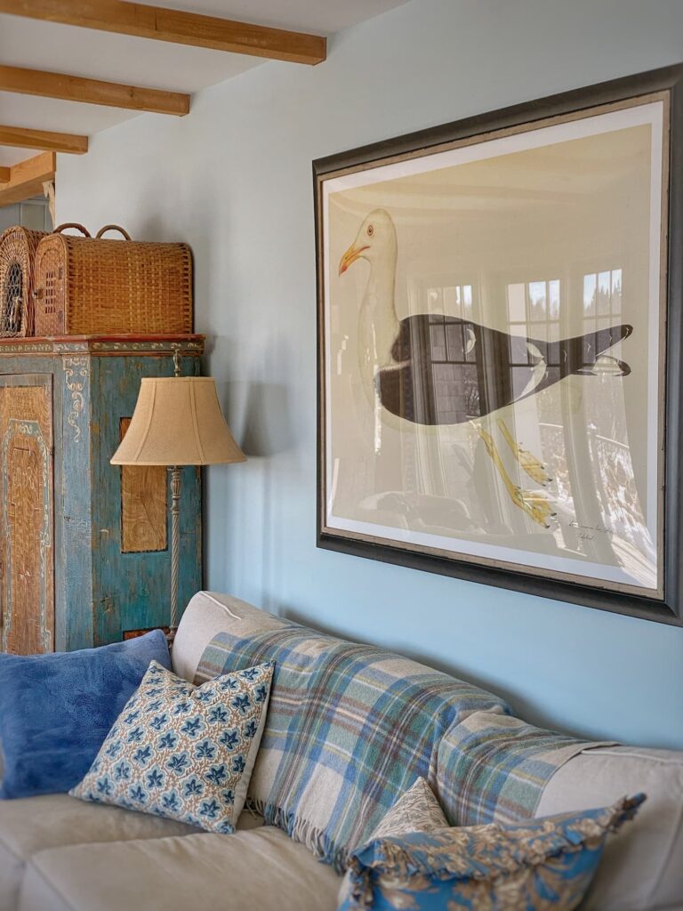
That’s not to say there aren’t some excellent digital prints out there these days, many of them mimicking the signs of age I love so much.
In fact, probably the biggest statement-maker in my living room is the enormous giclee print of a watercolor drawing of a seagull by Swedish scientist Olof Rudbeck (1660-1740). It really sets the tone for this space. I ordered it from Museum Outlets, They come framed and unframed. I had mine framed locally.
And yes, it comes in smaller sizes!
Etsy is a good source for both vintage/antique and new-but-made-to-look-old prints. Some of them you can even download and print at home!
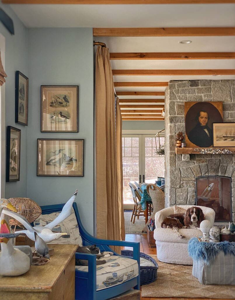
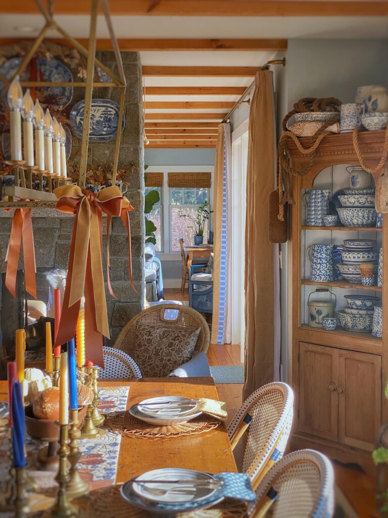
Antique and Vintage Prints in My Home
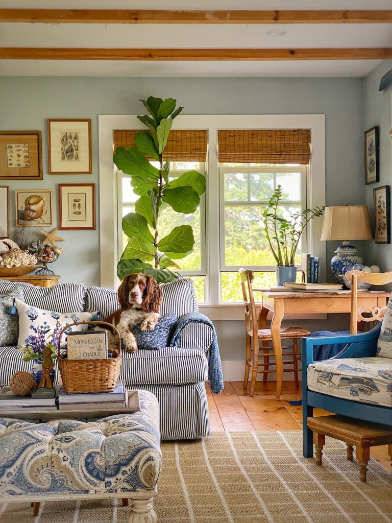
When I decided to write this blog post, I was really just thinking about all the antique/vintage prints I have in the living room.
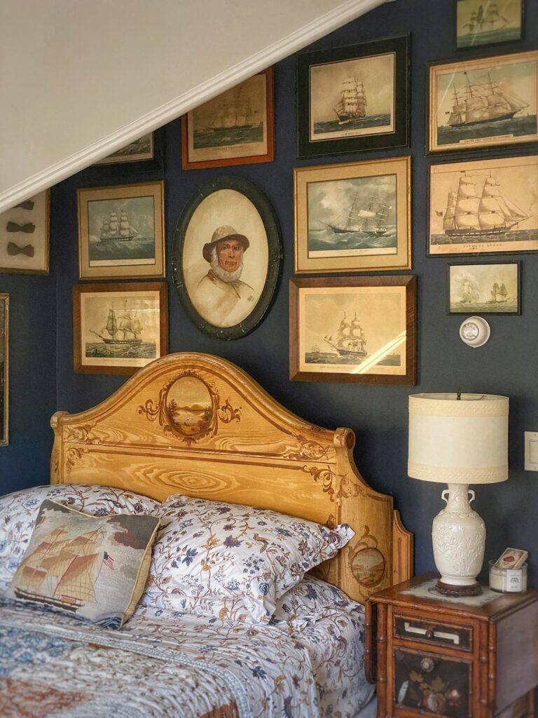
But of course there is the wall of old ship prints in the Captain’s Bedroom.
And, oh yes, the gallery display of small botanicals I hung in the primary bath last year.
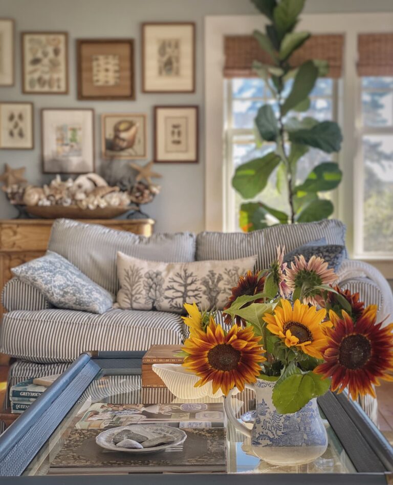
Plus two fabulous sunflower prints that were my mom’s.
Four beautifully framed florals that I scored at an auction. They are in the bedroom, flanking a watercolor painting of my kids when they were little.
Antique or vintage prints just always seem to answer my decorating needs in an affordable way.
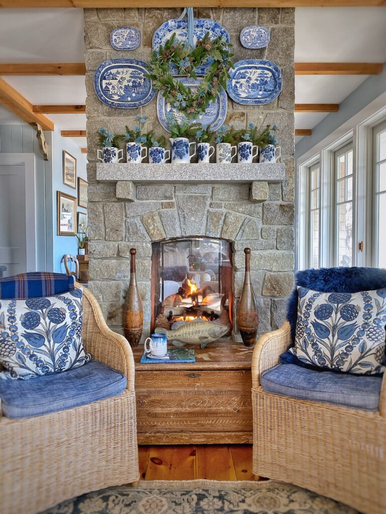
Winter mantel 2.0
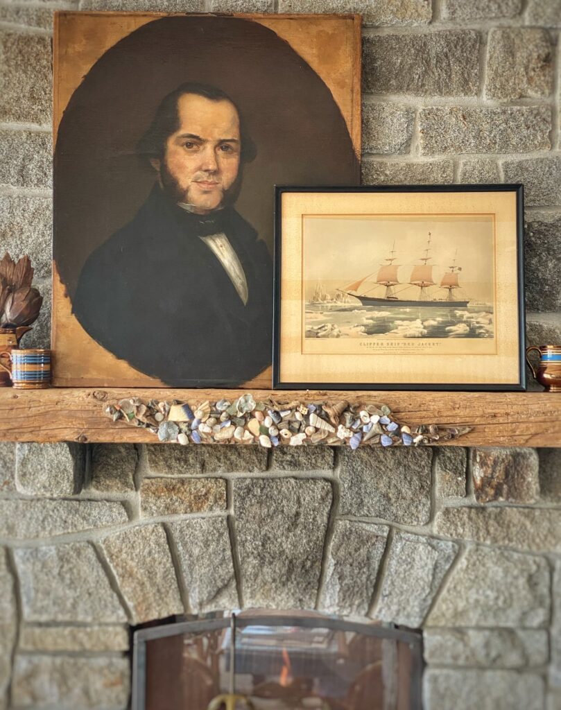
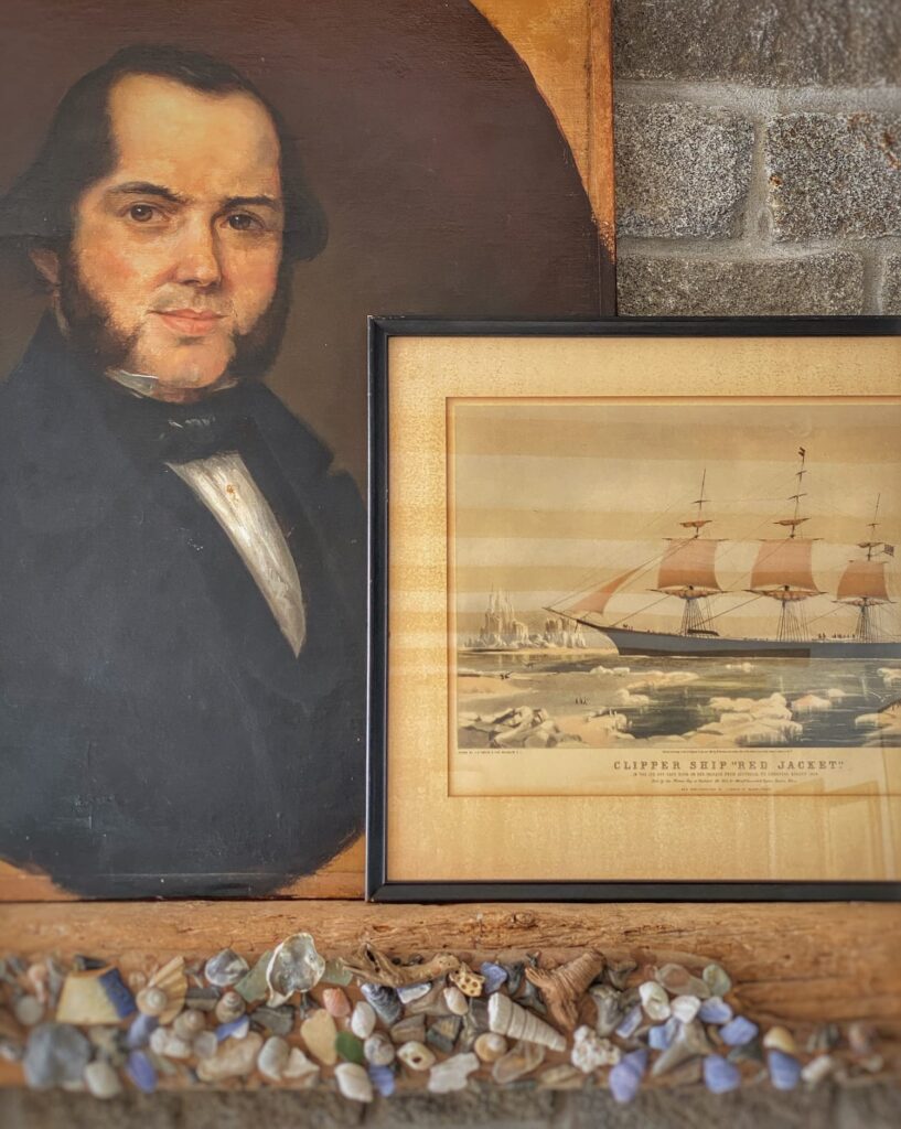
I went out last Saturday looking for a piece of ship art to join Captain Ward on the mantel in the living room. I thought it would be a fun nod to the history we have created for him.
The vintage halftone print of the Currier and Ives lithograph The Clipper Ship “Red Jacket” in icy waters couldn’t be more perfect!
The print’s muted colors pick up on the blacks and golds in the painting, and the scale of it tucks in nicely next to Captain Ward. I also like the way the graphic print plays with the moody oil painting.
And, believe it or not, the Red Jacket was actually built in 1853 in the nearby town of Rockland. While the scene depicted in the print is the ice off Cape Horn, it looks an awful lot like the view out my window these days, ha!
I couldn’t be happier with it!
Prideaux John Selby seagull etching
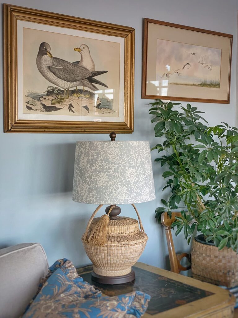
I wrote recently in my post My February Home | Clean, Fresh, and Bright, but Still Cozy about how I rehung some artwork in the living room.
The lovely 19th century hand-colored etching is from Prideaux John Selby’s Illustrations of British Ornithology. I sat through a long auction to bid on this piece. It is one of the nicest prints I own, though, so it was worth it!
Jacob Studer’s “Popular Ornithology, the Birds of North America”
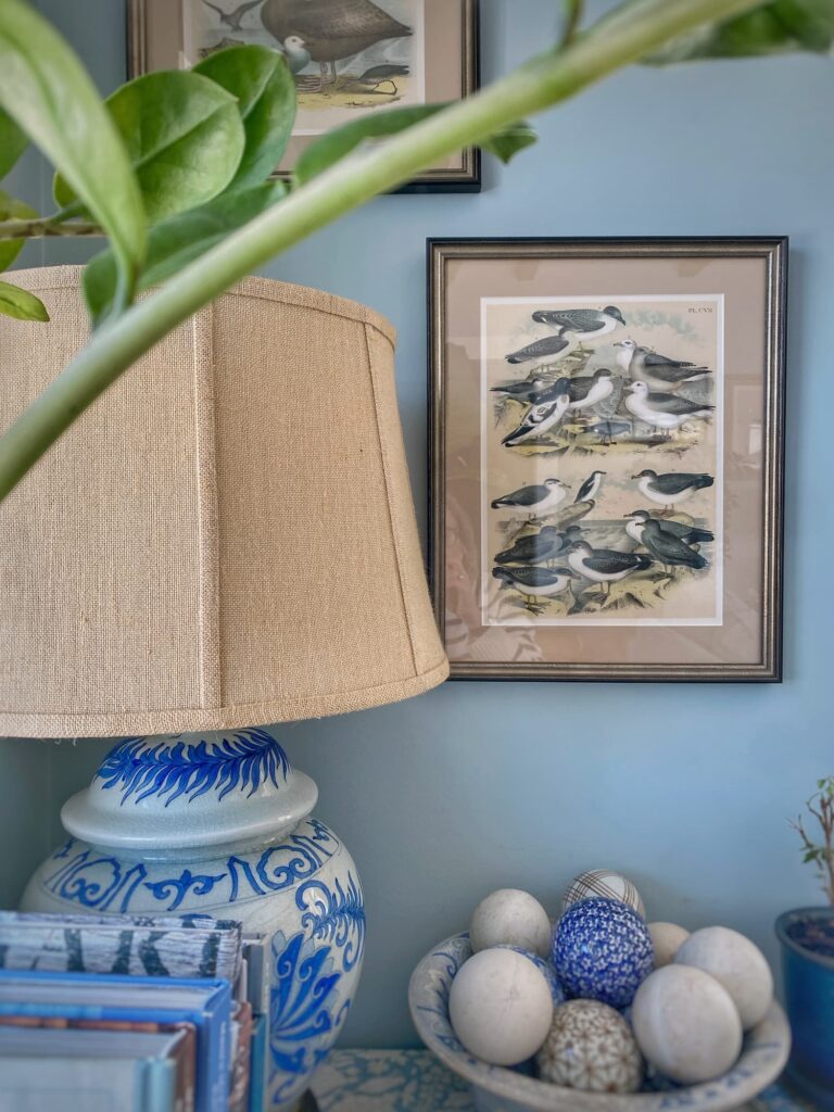
A collection of seabird prints from Jacob Studer’s “Popular Ornithology, the Birds of North America” were some of the first old prints I bought for the house. Studer’s book was printed in 1881 with chromolithograph images. It was republished in 1977.
I have examined my prints closely with a magnifying glass, but I truly can’t tell which edition mine are from.
Either way, they make lovely groupings on either side of the windows, without detracting from the water view. In fact, when the seagulls gather out on the rocks, I think they enhance it!
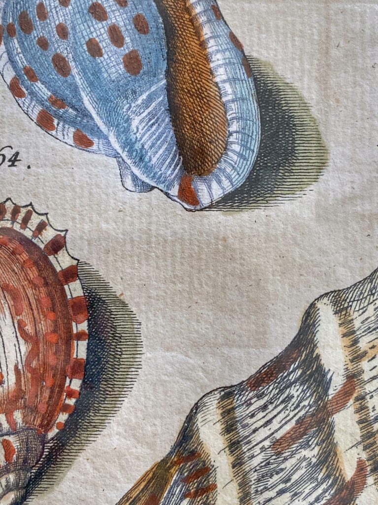
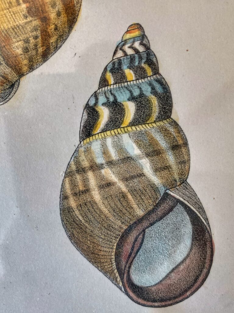
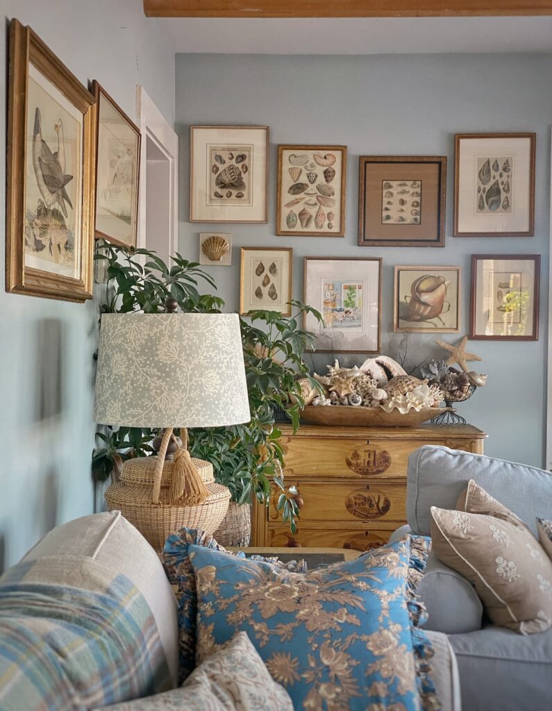
Shell print gallery wall
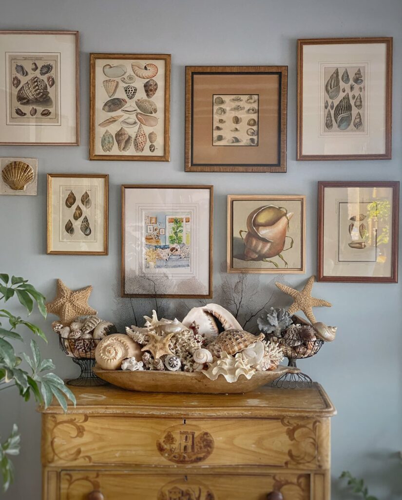
Everyone’s favorite seashell gallery wall in the living room is a mix of antique and new prints and original artwork.
I bought most of the antique prints, already framed, at an estate sale in Maryland. They appear to be antique hand-colored lithographs.
The print in the upper lefthand corner is from a local antiques store. It is a beautiful hand-colored etching by Friedrich Wilehelm Martini dating to the mid 1700’s. You can see the impression of the printing press surrounding the image. So special!
This gallery is a perfect example of how fabulous antique/vintage prints look grouped together!
Sailing ship gallery wall
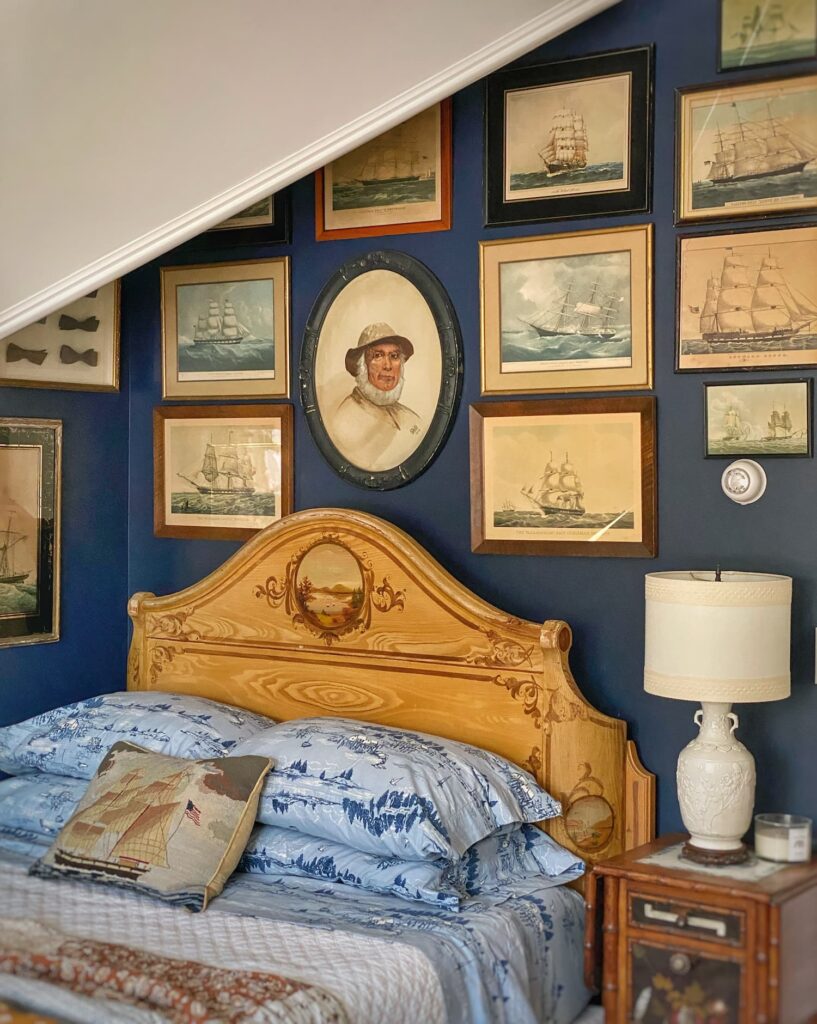
The gallery wall in the Captain’s Bedroom, with its theme of sailing ships, is another fun grouping of old prints.
Some are nice old halftone Currier and Ive’s reprints from the 1940’s and 50’s with original frames.
Others are more recent, and maybe not so special by themselves.
But all together, they create a wall full of character and dimension.
Botanical gallery wall
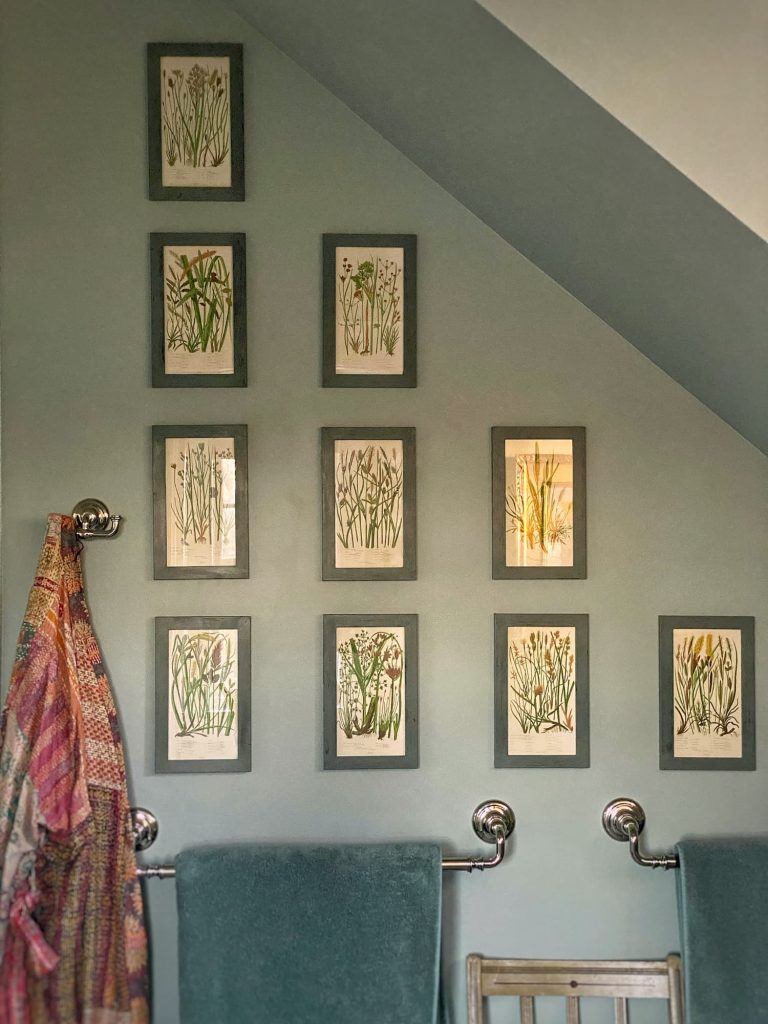
Last spring I did a little refresh in the primary bathroom and hung a grid of small botanical prints.
I got these at an antiques mall. They are illustrations from a book, but I have no idea of their age or provenance.
I was drawn to them because of their colors, small size, and the fact that they are botanicals, but not flowers.
Hung together, they make a big impact!
You can read all about my bathroom refresh in my post Meadow & Marsh | My Coastal Maine Bathroom Inspired by Nature.
And how to hang a gallery wall, Hang a Perfect Grid Gallery Wall With No Extra Nail Holes.
Sunflower etchings
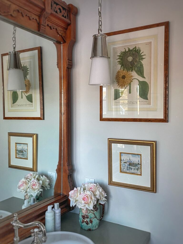
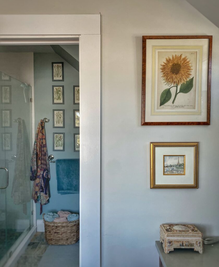
I have two antique sunflower prints which also hang in the bathroom. They came from my parents house.
These beautiful old hand-colored etchings always make me think of my mom.
This Week Into Next

We had all the weather last weekend — snow, cold, ice, and wind.
I spent Sunday at home, changing into my flannel pj bottoms, a cozy sweater, and wool socks early in the evening.
And then Monday it was time to get out and tackle the snow and ice around the house. Despite my shoveling and salting, the driveway is still a slick of ice. It should start to melt when the temps finally get above freezing next week.
The snow wasn’t all work and no play, though. I got out on my snowshoes a couple times, which was delightful!
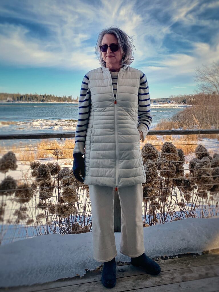
Winter white jeans
A few of my blogging friends got together last week to write about how to style white denim for winter.
They mostly live in less wintry climes, but still inspired me to give it a try here in Maine.
I didn’t think my true white jeans would work here, but I took advantage of a J Crew Factory sale and ordered a pair of “ecru” wide-leg jeans. They arrived on Thursday, and I immediately took them out for a spin on Friday.
I have to say I am in love! They feel fresh, but still cozy paired with a cashmere sweater.
All J Crew Factory jeans are still on sale for just $49.95! Time to stock up!
And check out Juliet’s white denim styling here and Kim’s here.
Yes, another photo of me here on the blog. I am trying to overcome my fear of stepping out from behind the camera…

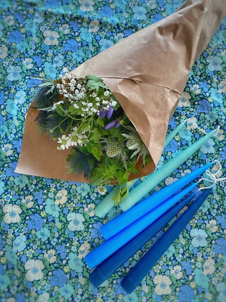
A cozy dinner
Next Thursday I will be joining some fellow creators to each share our menu for a “cozy dinner”.
In preparation for that, I am having some friends over on Sunday.
Since we have all pretty much been hibernating this winter, I decided to do it up with colorful candles and fresh flowers.
I will be sharing it all next week!
Be well, friends!

Questions, comments, or just want to say hello?
I’m always happy to hear from you.
Loved learning more about your vintage prints & gallery wall. Fascinating learning the specific difference between print methods – I’ve heard the terms but wasn’t sure what they all meant. Love your white jeans!
Hi Danielle — I am so happy you enjoyed this post. As I said, I still have a bit of a hard time identifying the different print times, but I hope if I keep looking at them closer, I will get better at it. I have never had a pair of “winter white” jeans before, but they are fun to have this time of year when I starting to yearn for warmer weather.
I have always loved etchings. Fun post. I love the lampshade on your wicker lamp, adds texture.
Hi Donna — Have you ever looked at your etchings up close with a magnifying glass? It is cool to see the lines and the crosshatch markings that create the shading. The lampshade was made by a local Maine artisan. I love it too!
I enjoyed the crash course in printmaking and have long admired your collection of coastal art. You’ve taken time to collect images that bring you joy and enhance your style. Thanks for sharing
Hi Karen — Thanks for reading! I am happy you enjoyed this post. It is always fun when I learn something new when writing a post!
Molly I’ve always enjoyed your blog and following you on Instagram I’m glad you’re branching out to include fashion along with your culinary and home decor talents!
Hi Kathleen — I am so happy you are enjoying my new content. It is always a little scary to step outside the box! Thank you for reading my blog!
Love the sailboat prints. They are my favorite too. And I love the winter white outfit especially the long vest!
Hi Ann — We better not come across a sailing ship print when we are out together, or there could be a tussle, haha! Winter white jeans are new for me, but I am loving them. Feels fresh this time of year!
Cute photo of you, Molly! I enjoyed learning more about your vintage artwork! Hubby has an old print-I think I should put the magnifying glass to it.
Hi Jane — Thank you! Trying to show my face a bit more… (Whether you all want to see it or not, ha!) Yes, definitely take a look at your husband’s print with a magnifying glass and see if you can figure out what it is!
Those jeans are terrific looking. I really love your vest, who makes that, Molly?
Hi Patricia — I am so happy with the jeans, and they were so reasonably priced. The vest is from Save the Duck. I got it a number of years ago.
Hi Molly
I was wondering if you get concerned about dampness or water on your prints that you hung in the bathroom.
I get concerned about hanging nice art in a bathroom.
Also are there certain auction sites on line that you have used?
I love your collection of pictures and artwork!
Thanks for your help!
Kim
Hi Kim! I have never had an issue with moisture in the bathroom. I have a good exhaust system, and it is only steamy in there a couple times a day at most, and for a short duration. I love Etsy for vintage finds. I have never really used any online auction sites. Auction Ninja is one for local auctions. And while often pricey, Chairish, has some lovely antique and vintage items.
Finally caught up enough that I can make a comment! I love all your vintage and antique prints! It was so interesting to learn about all of the kinds! Your ship print is so cute with the captain! I have always loved prints as well but have been buying newer on vacations now. I have been wanting to try some new jeans so I will have to try the J Crew ones. Not sure I will do ecru but maybe! I really like that you are adding some clothing to your blog. Nice to see some fashion! Mom would really like it!
Amy
Hi Amy — It was fun learning more about antique and vintage prints for this blog post! I need to get a better magnifying glass so that I can really see the details. And yes, I did get my love of clothes from mom!